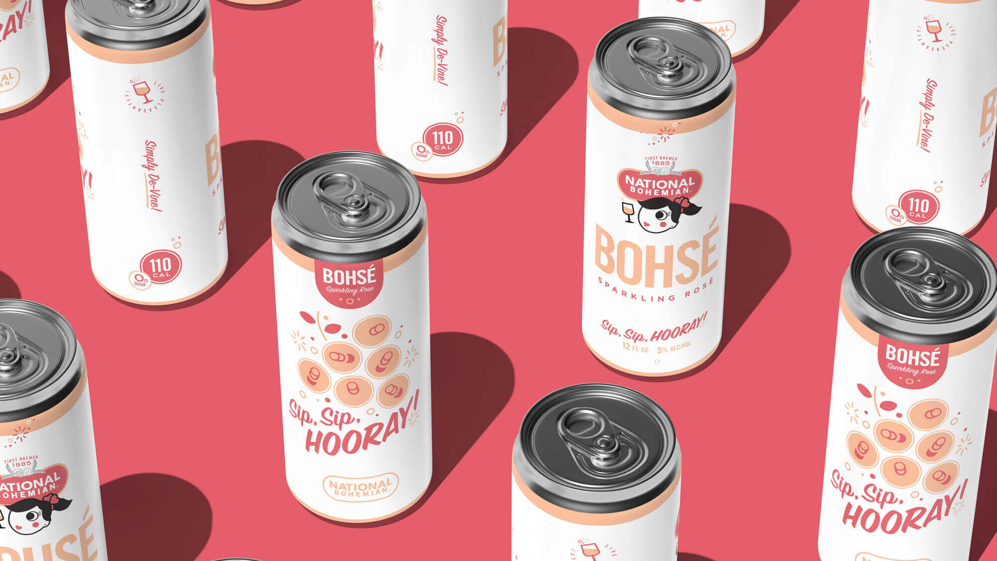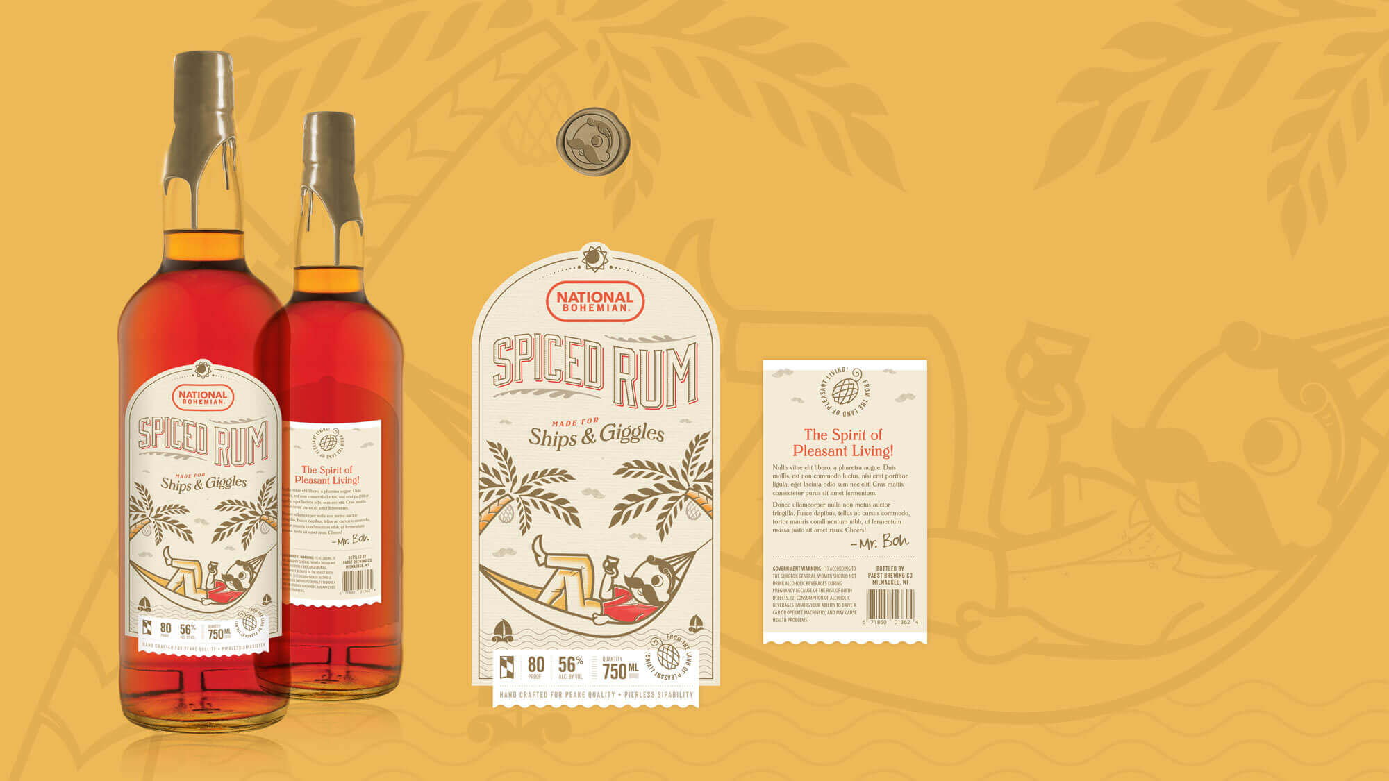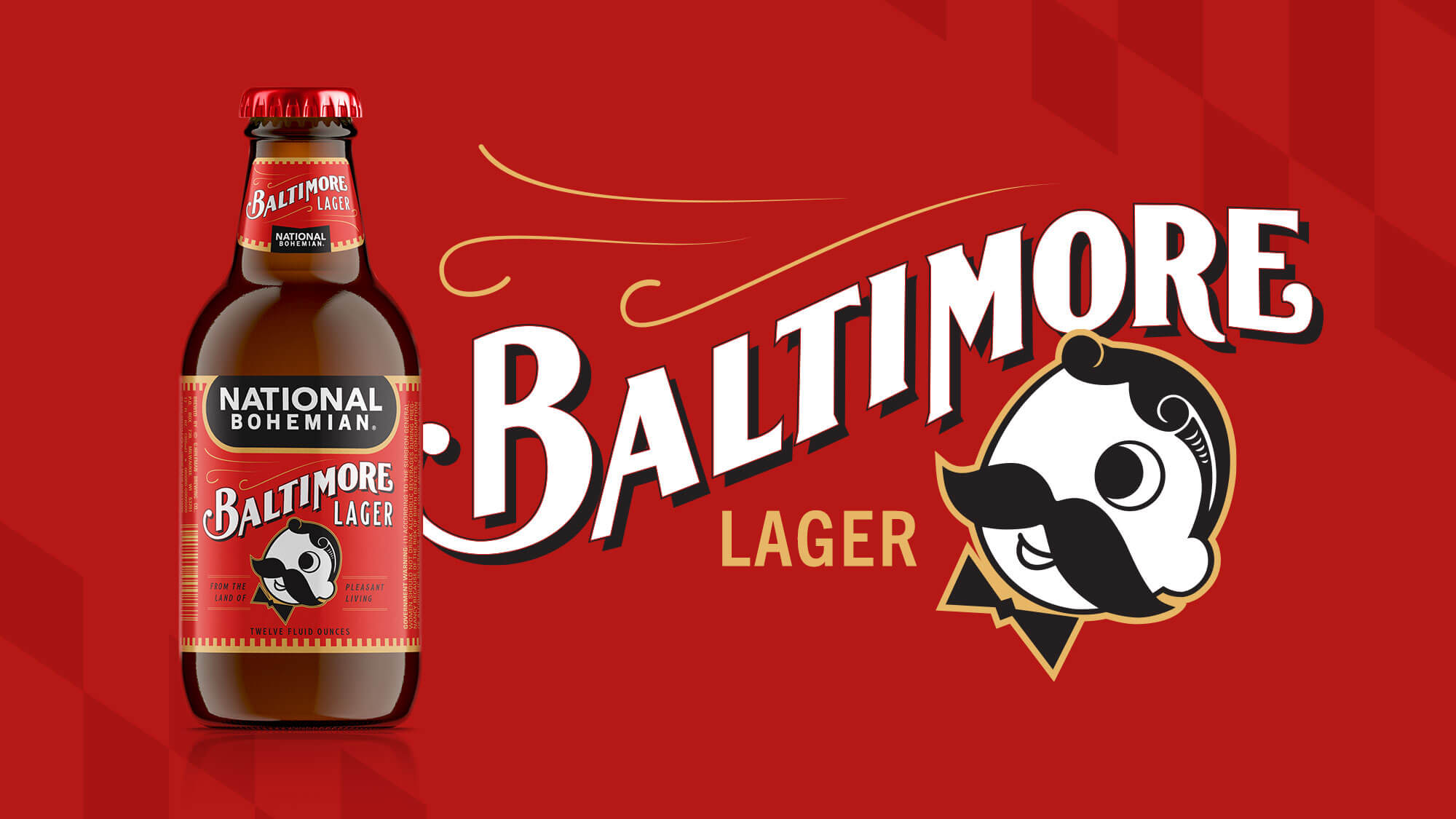
Natty Boh Packaging
Oh Boy, What a Can!
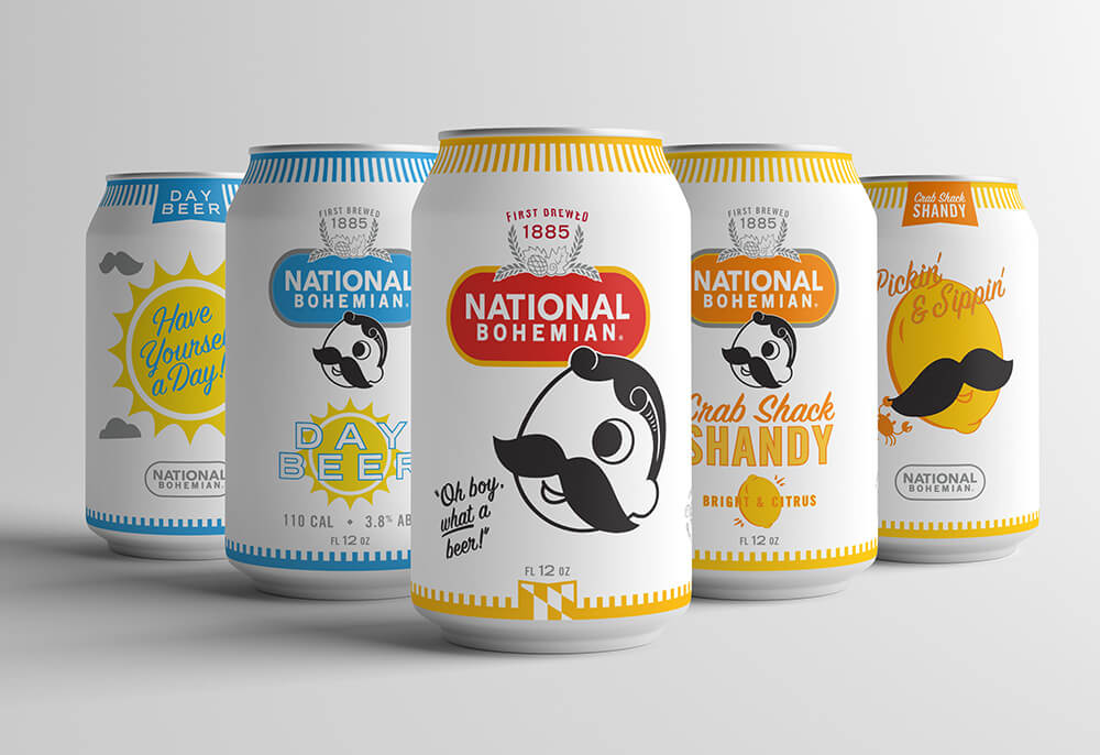
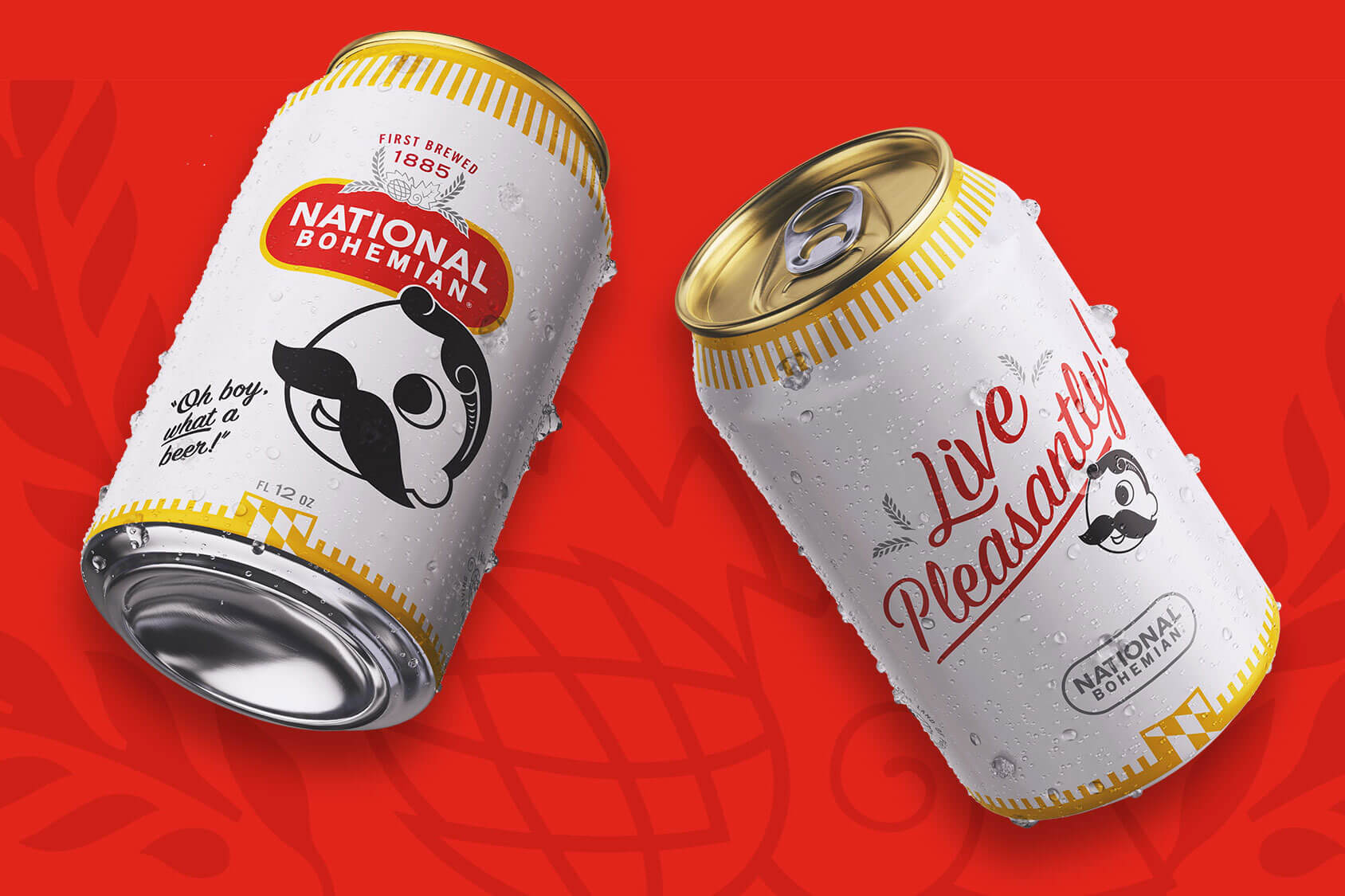
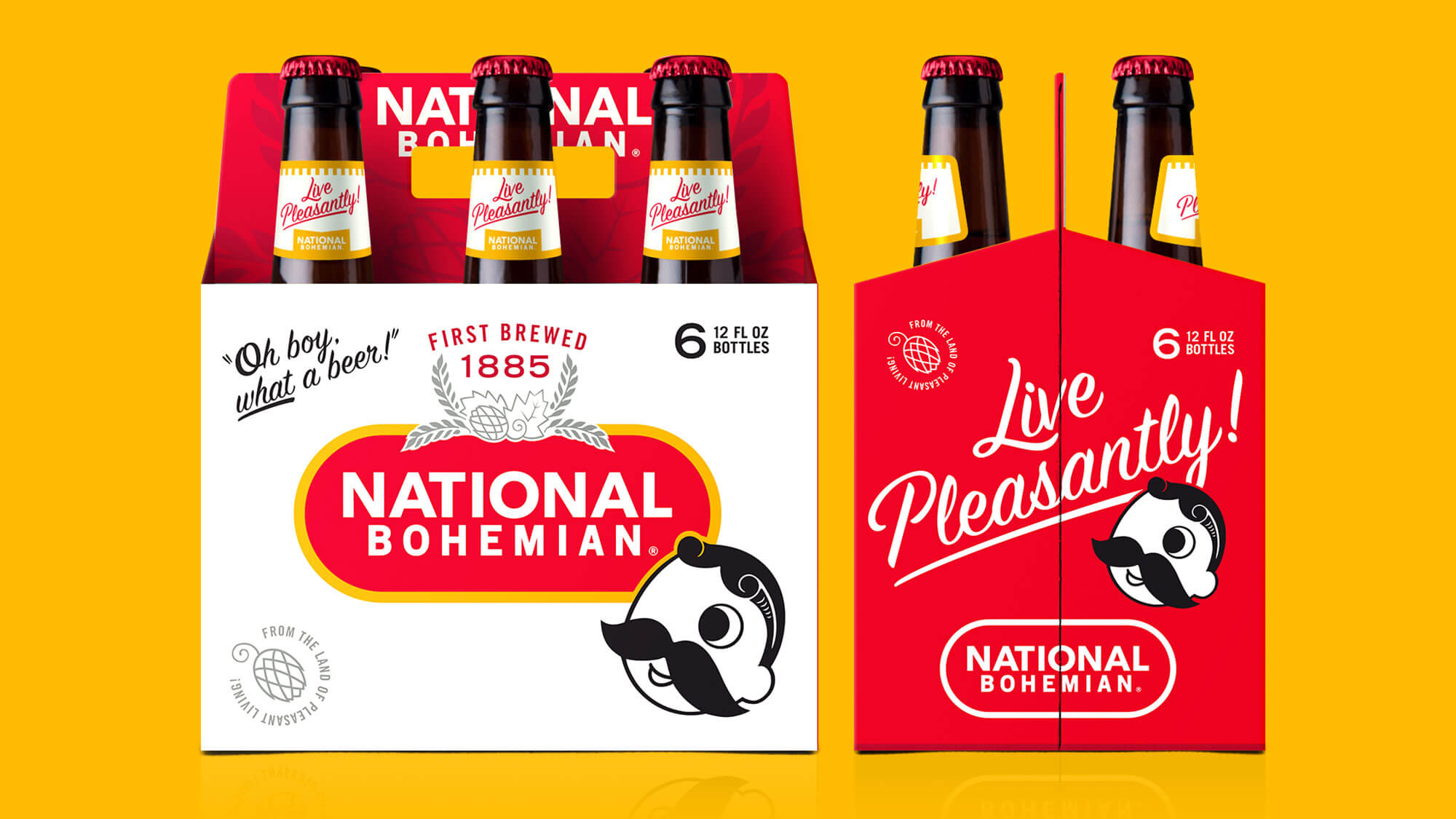
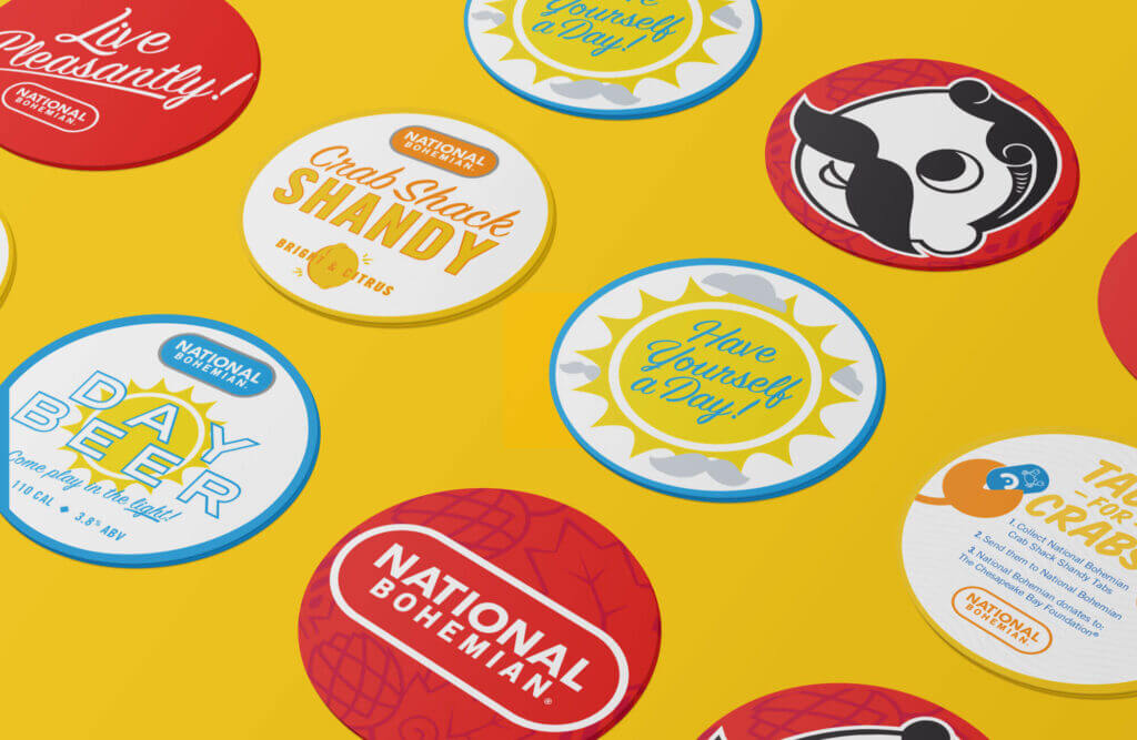
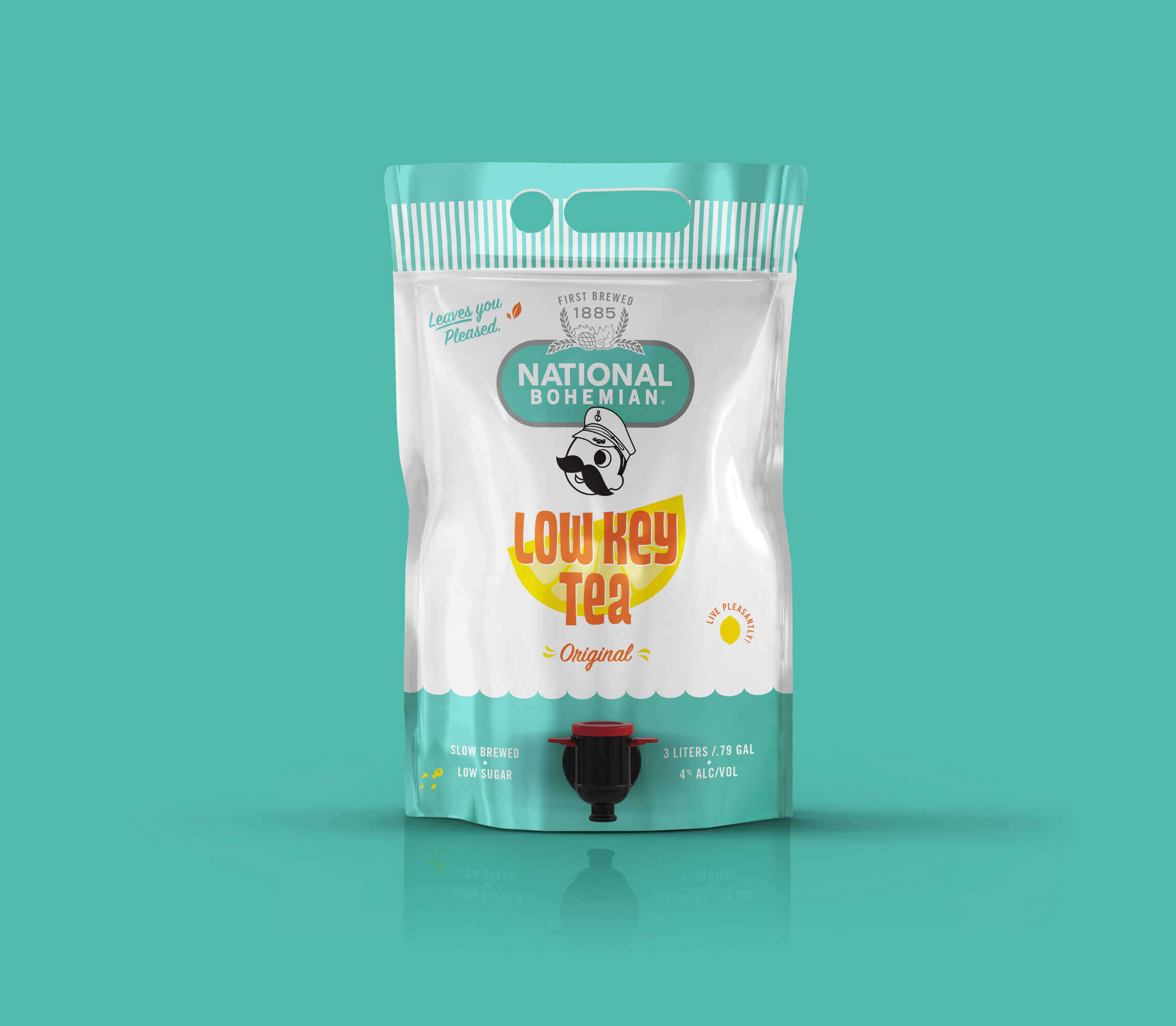
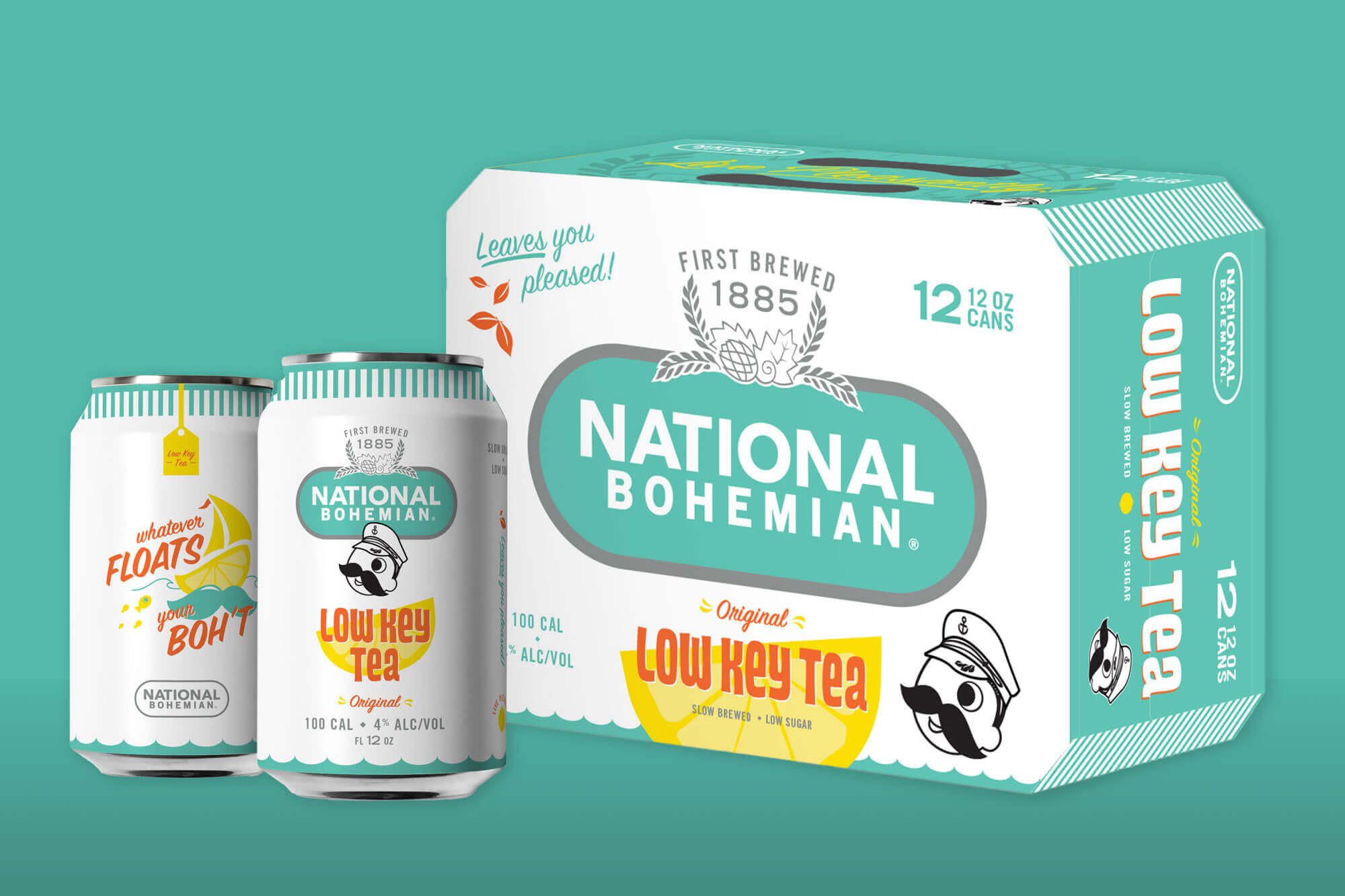
It’s a lofty task to reimagine a local legend that almost everyone has an emotional connection to, but the Mission team approached this project with Boh’s motto in one hand and storied history in the other. Combining the two took countless conversations, more than a handful of brainstorming sessions, and even a few taste tests along the way. Mission tactically evolved elements on the Boh packaging from the primary “pill” logo down to the smirk on Mr. Boh’s face, all to reinforce National Bohemian’s ethos “Live Pleasantly!”
Client
Capabilities
Designing a Versatile Graphic System
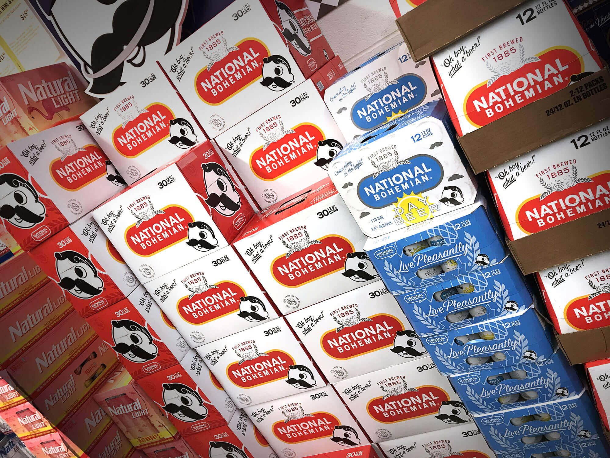
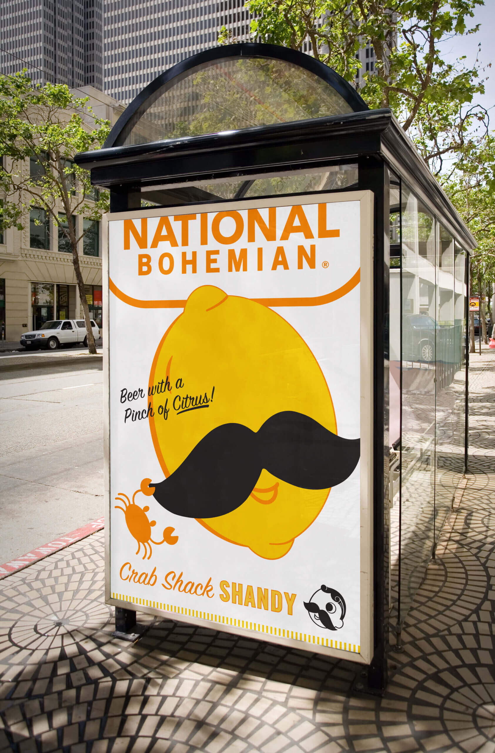
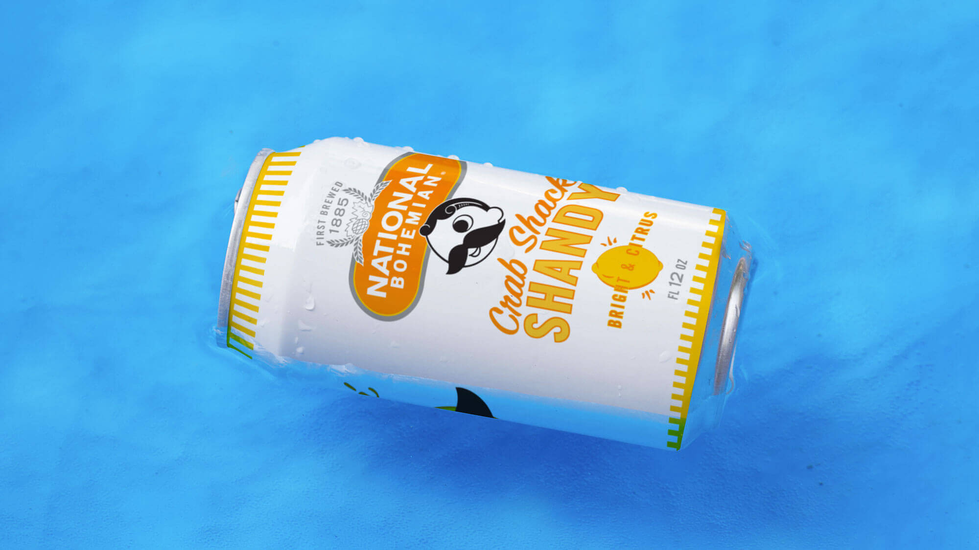
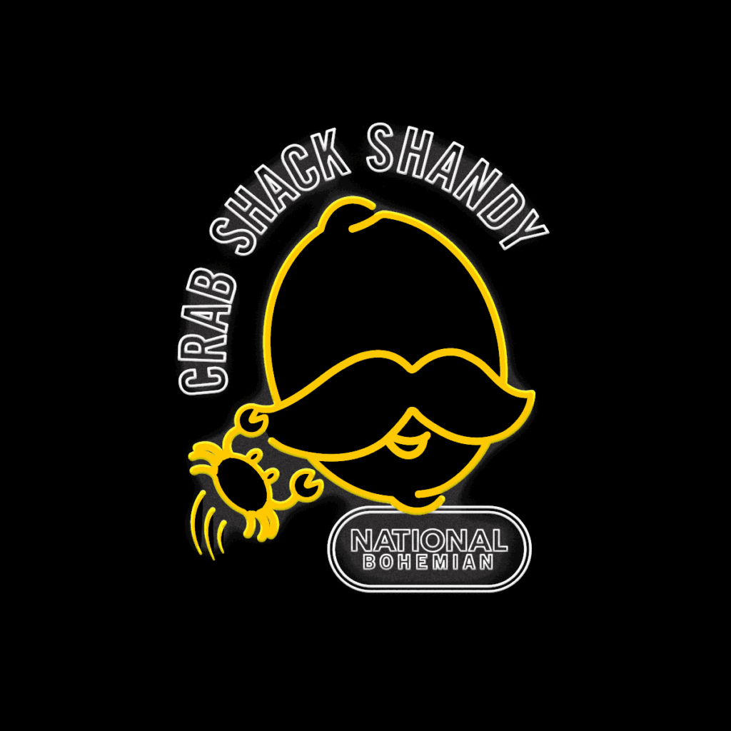
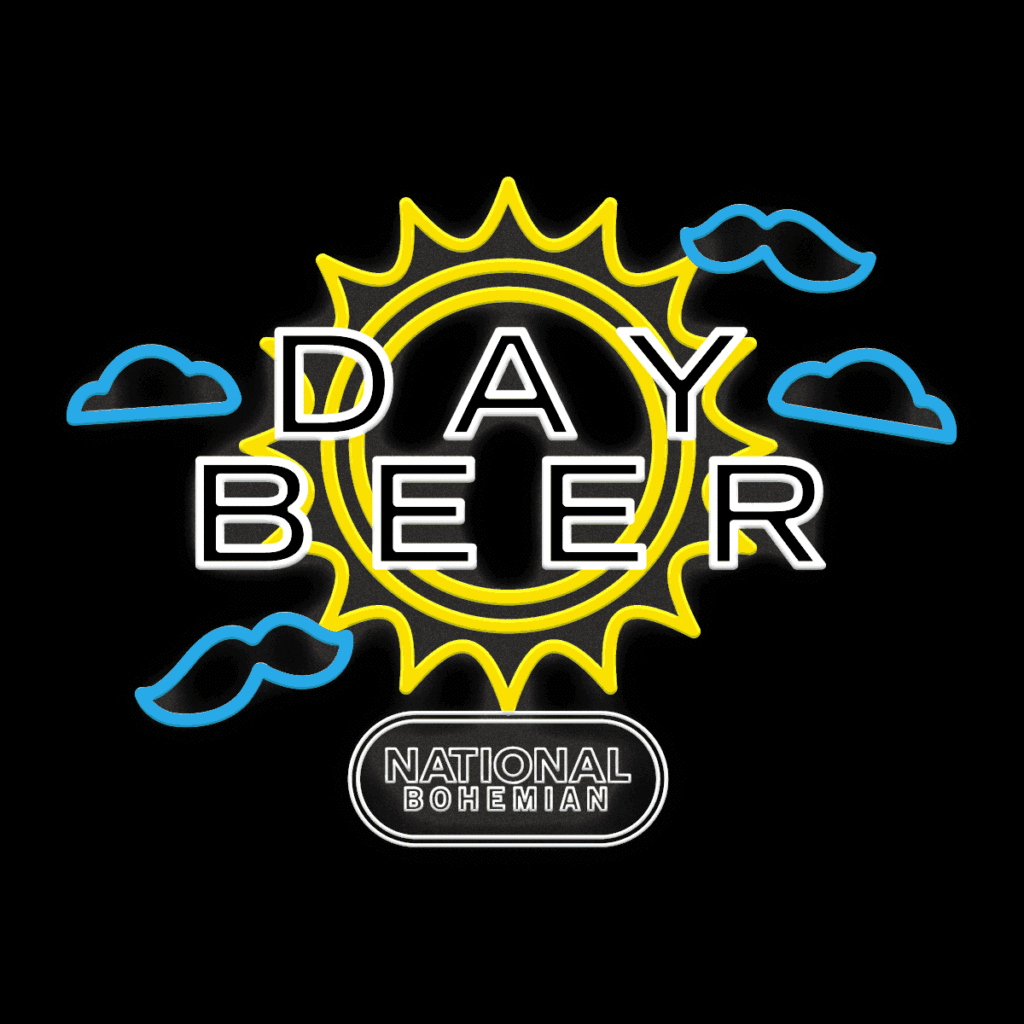
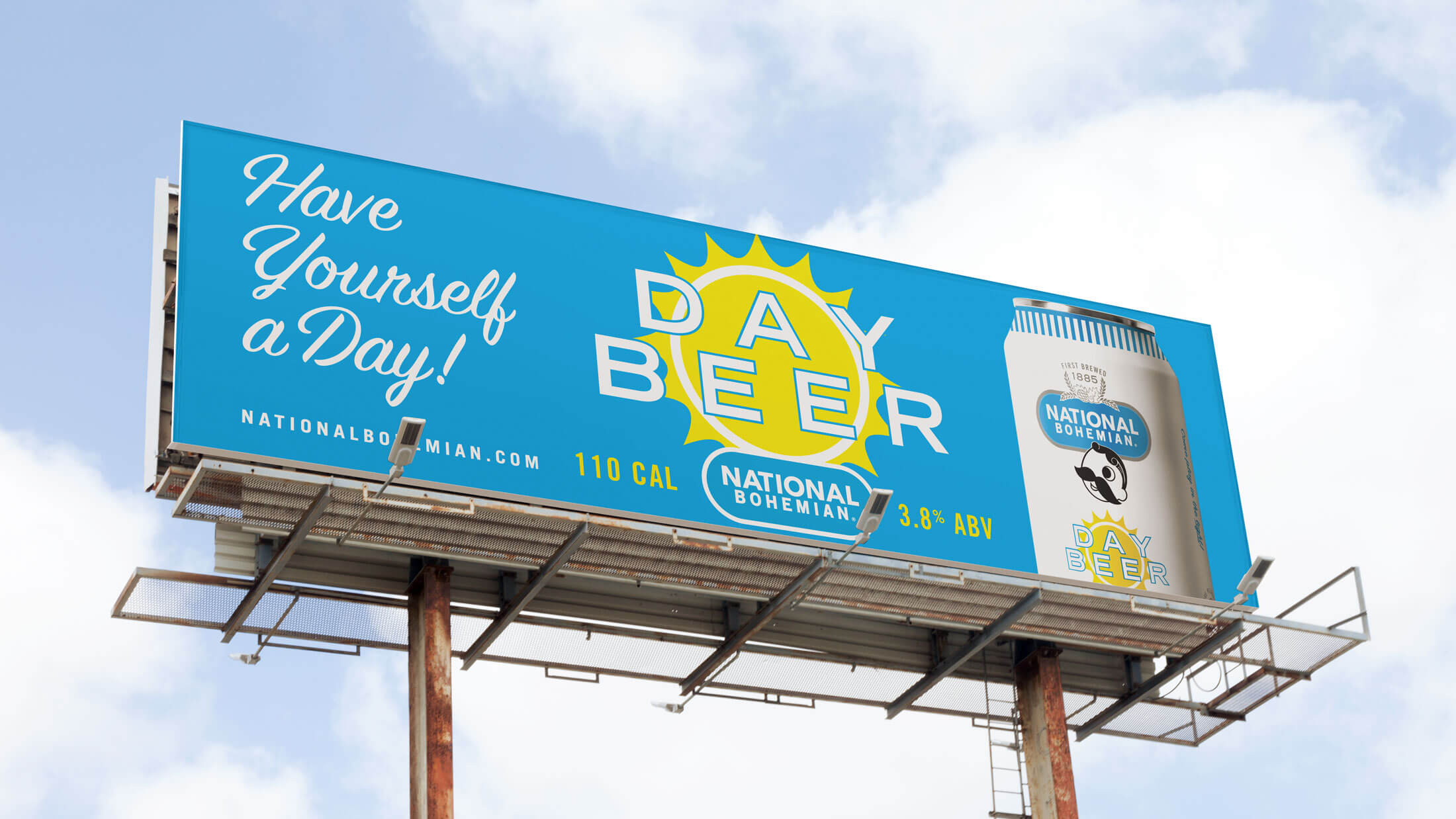
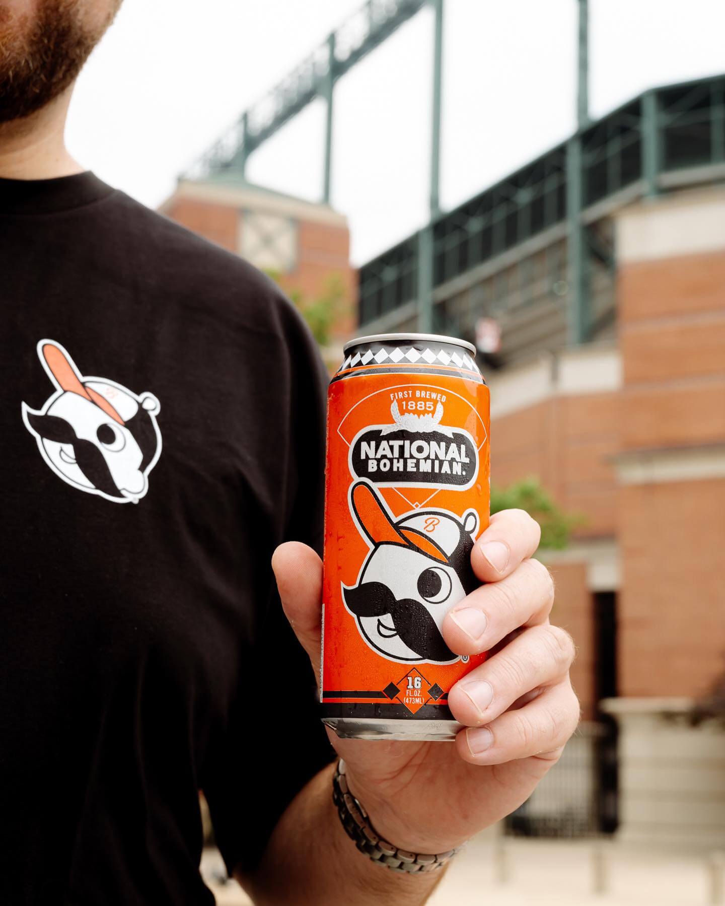
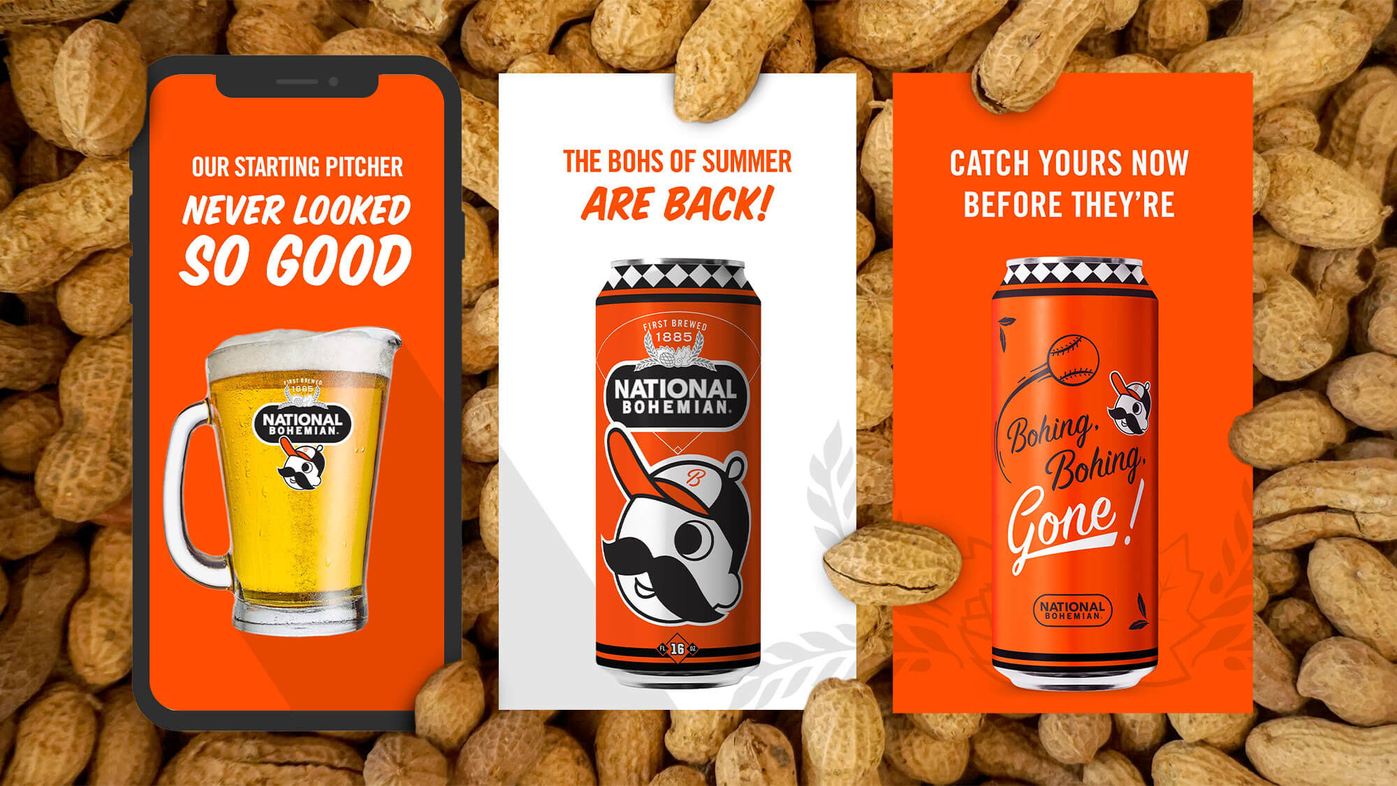
We created a versatile graphic system, starting with the four-can designs then moving onto bottles, secondary cartons, 6-, 12-, and 30-packs, and in-store promotional items. The packaging stayed true to the legacy of the brand, capturing the attention of long-time local drinkers while remaining relevant to city transplants and new markets up and down the East Coast. The icing on the cake was designing unique tall-boy cans for the Ravens and Orioles. The only thing better than a cold Boh at Oriole Park is being tapped to design the can.
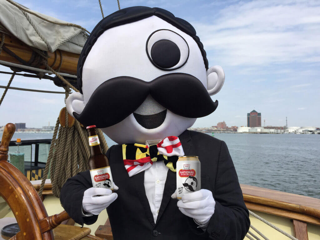
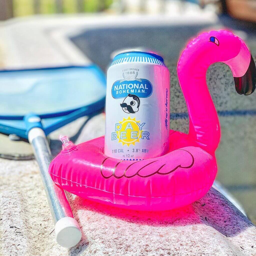
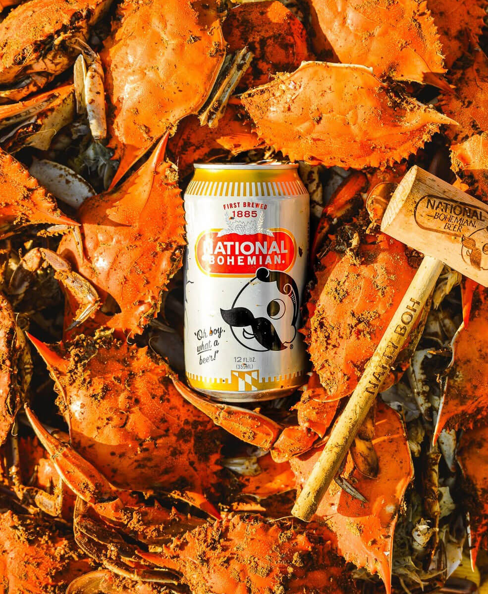
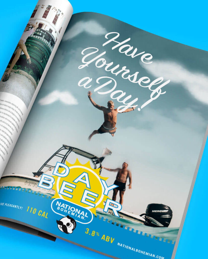
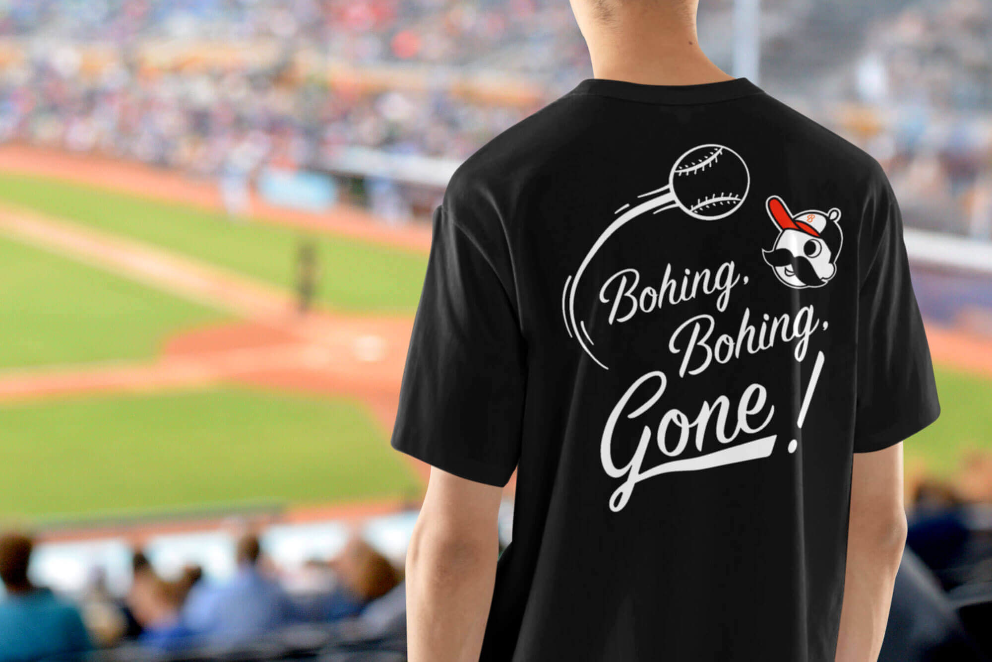
Courtesy of @nationalbohemianbeer
Proof of concept packaging