Parkview Ortho x ONE
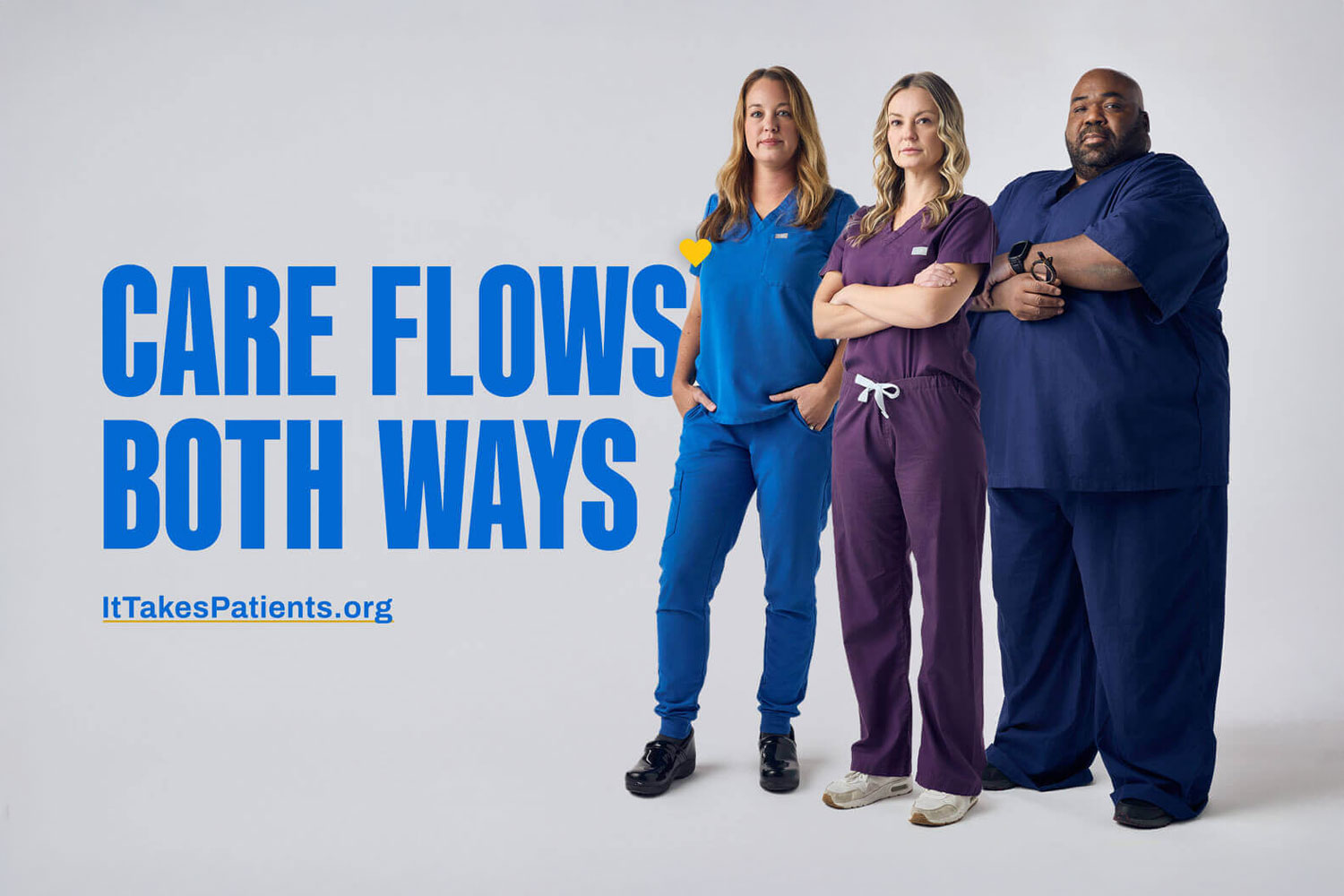
World-Class Care
Parkview Ortho Hospital is a specialty hospital in northeast Indiana focused exclusively on orthopedic surgery and recovery, in partnership with the physician group Ortho NorthEast (ONE). These two leading providers wanted to build awareness of their partnership and world-class care, while also driving an increase in appointments and orthopedic evaluations.
Client
Industry
Capabilities
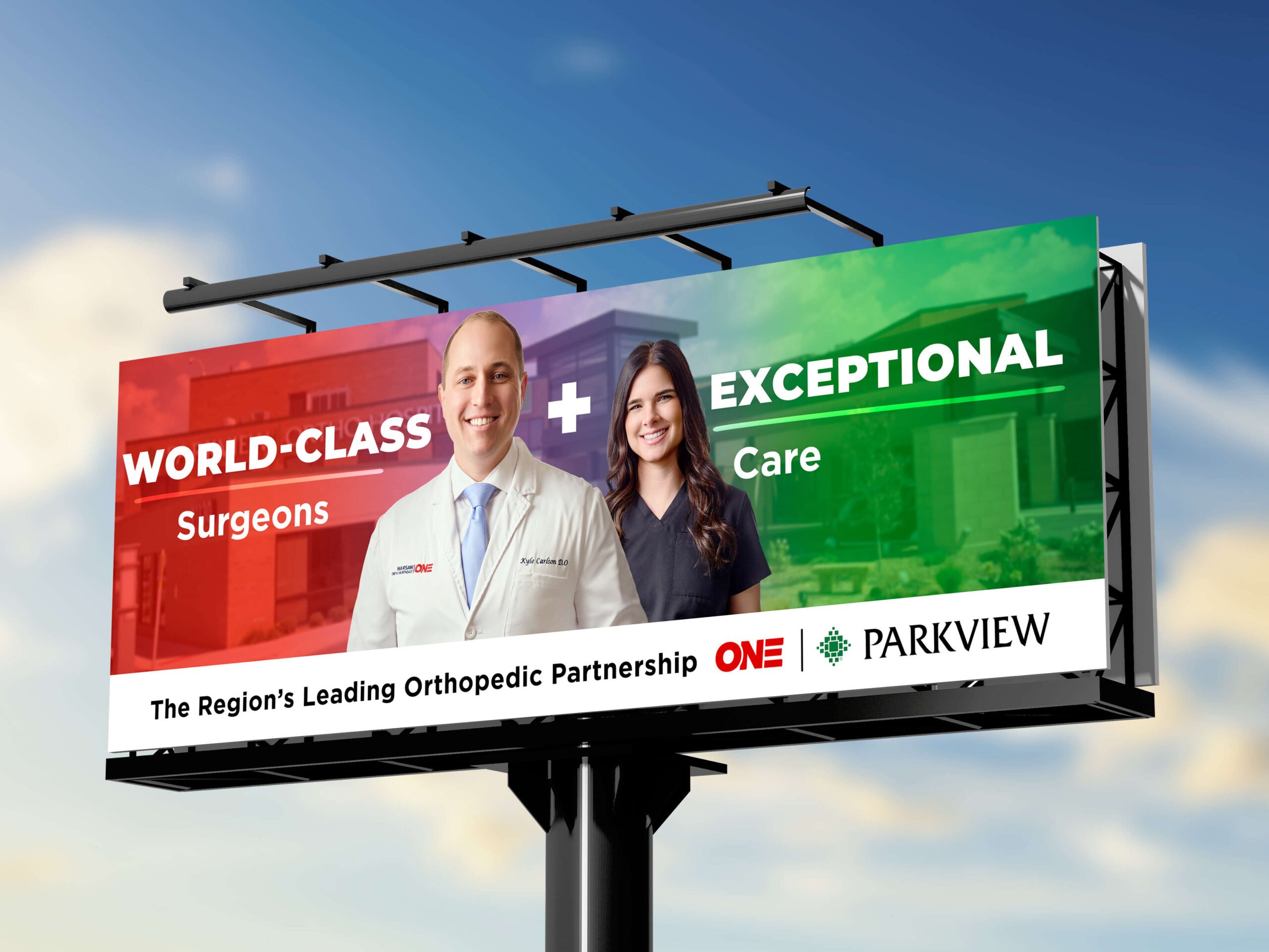
The Region’s Leading Orthopedic Partnership
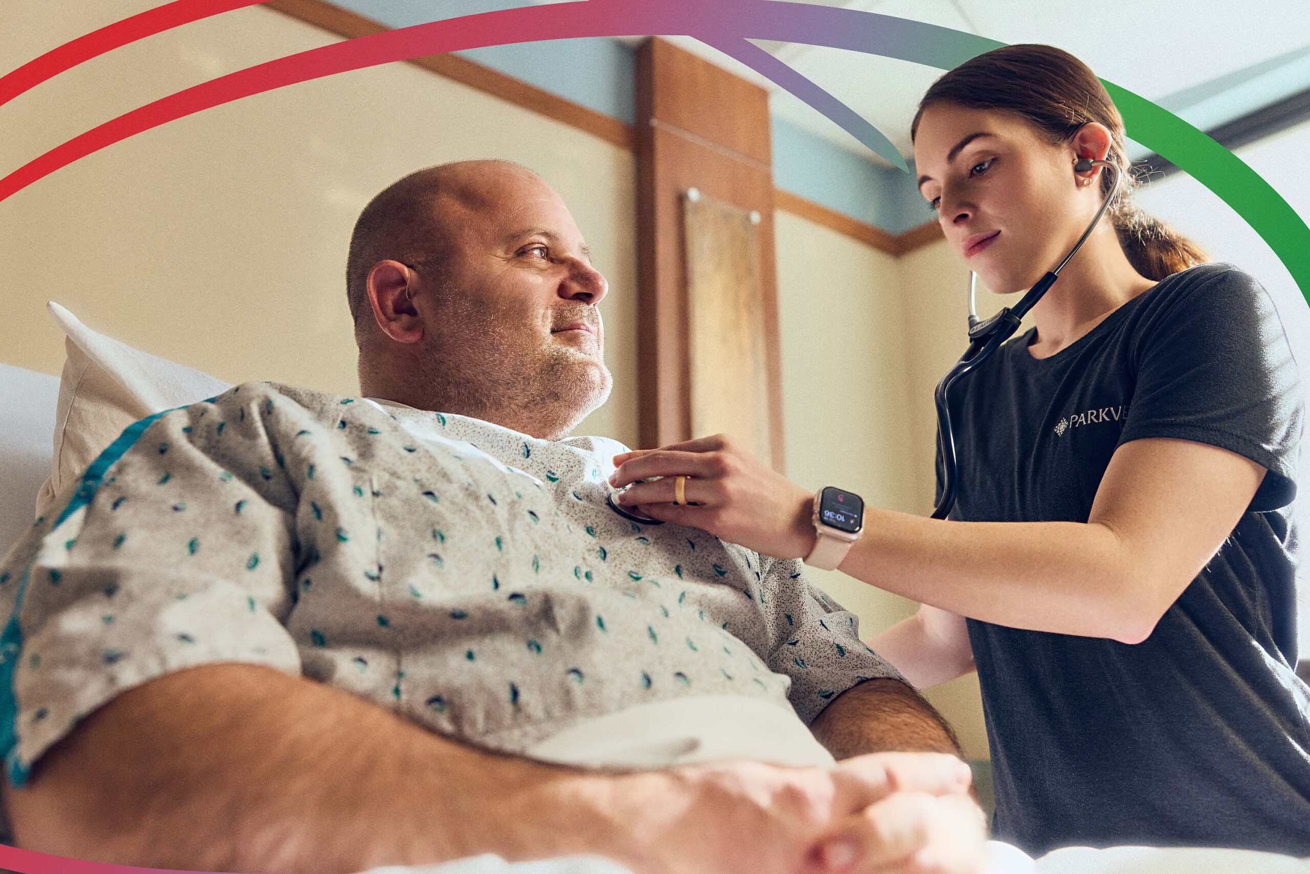
Mission developed a strategic campaign to increase patient visits to ONE—ultimately driving more surgeries at Parkview—while emphasizing the collaborative relationship between the two entities and elevating their shared reputation for advanced, high-quality care in the area and beyond. It was important to balance both brands, and if you know anything about colors—red and green don’t always mesh (outside of December). Creating a gradient that mirrored the patient’s journey from provider-to-provider—from pain to relief—helped us incorporate even more of the story across designed assets.

The Color Story
The campaign gradient samples each provider’s color palette to represent the patient journey. When a patient is in pain and life comes to a standstill, they visit ONE (red) for a consultation. When surgery’s appropriate, they procedure happens at Parkview (green), resulting in a return to life on their terms.