Brewer’s Art Branding & Packaging
Brewer's Art Packaging Redesign Balances Creativity & Cohesion
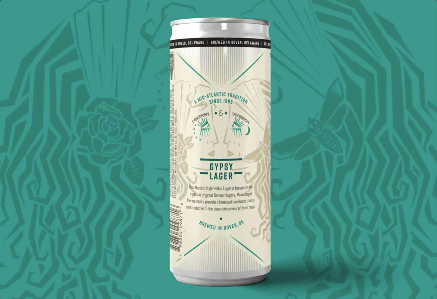
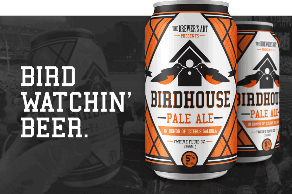
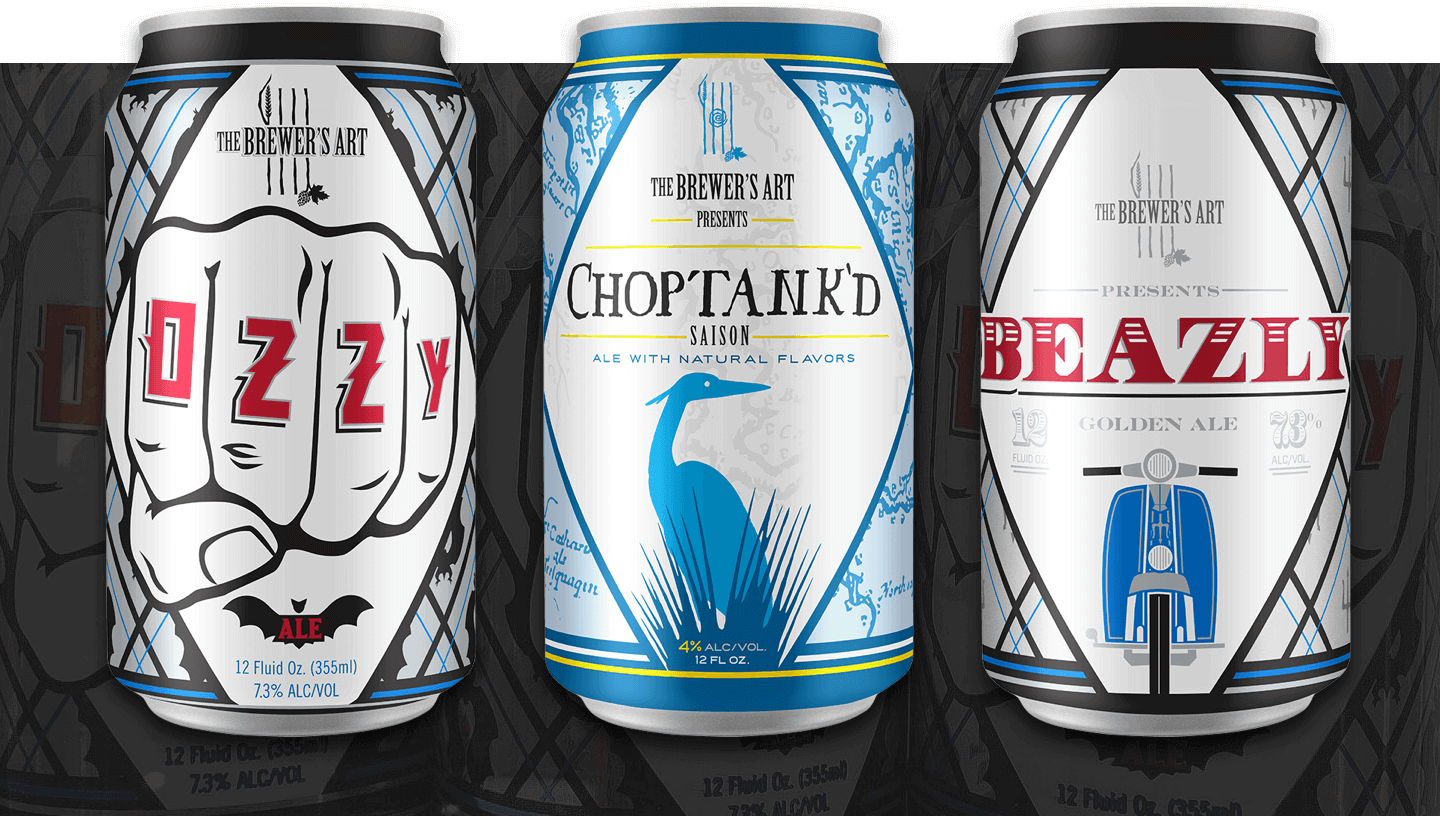
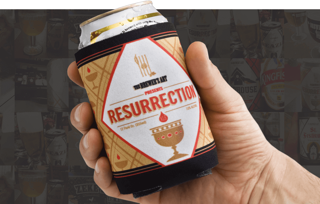
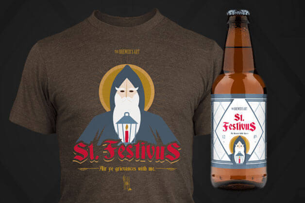
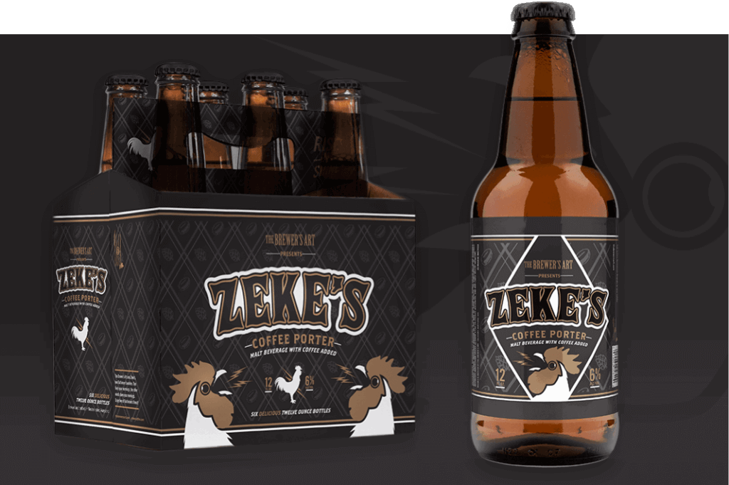
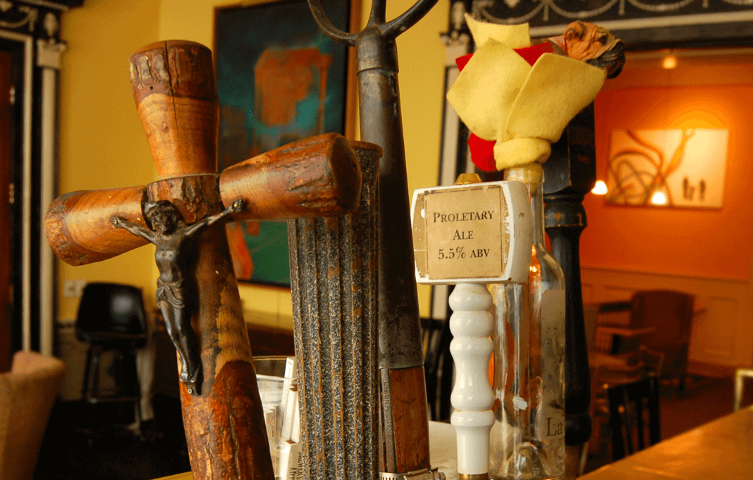
When The Brewer’s Art, one of Baltimore’s most beloved breweries, tapped us for a packaging and marketing overhaul, we knew it was an opportunity to create something truly special. Our challenge was to capture the unique essence of each beer while maintaining a cohesive brand identity. With beers like Resurrection Ale, La Pétroleuse, and Zeke’s Coffee Porter, each design had to reflect the individuality of the brew while connecting to the larger Brewer’s Art family.
Client
Industry
Capabilities
Creating a United Family of Black Sheep
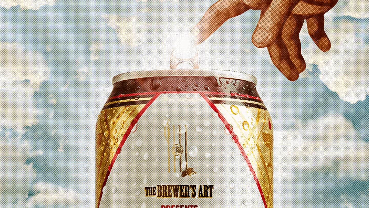
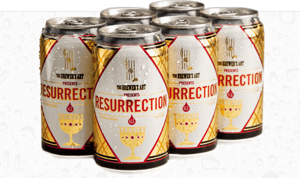
We developed a packaging system that cleverly united each beer under the Brewer’s Art umbrella, allowing for distinct identities without losing the brand’s signature style. For the launch of Resurrection, the brewery’s most infamous creation, we pushed boundaries with an edgy awareness campaign that played off the name’s provocative nature. From poster designs to anniversary brews, each project blended irreverence with charm, delivering a bold, unforgettable aesthetic that resonated with both die-hard fans and casual drinkers.
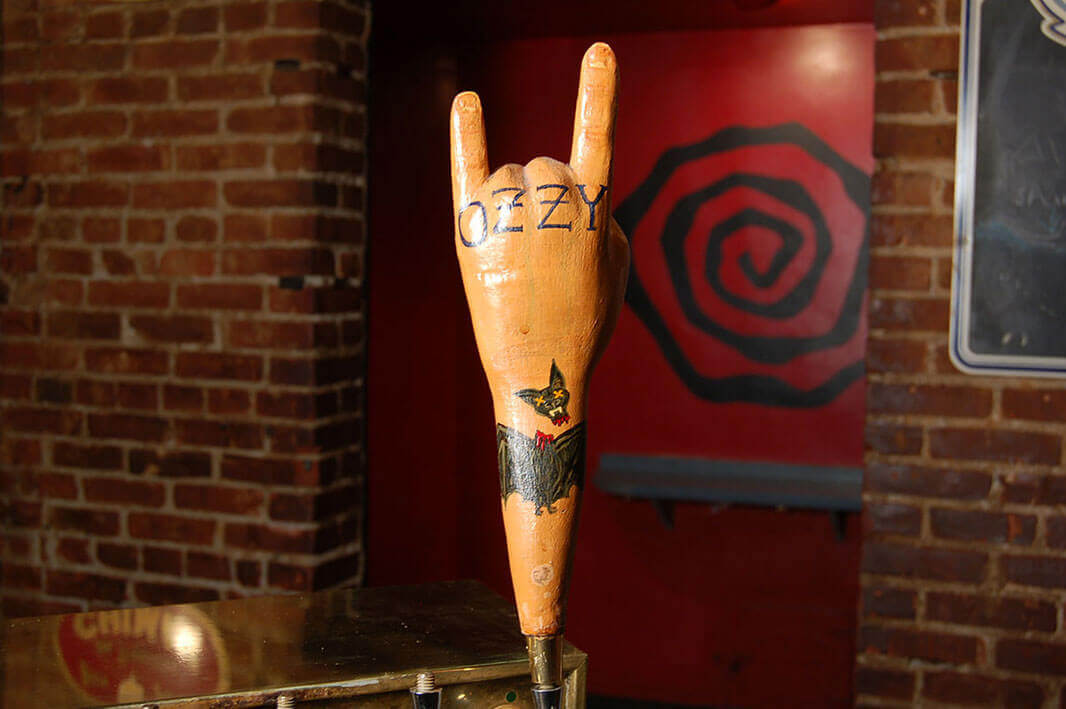
“If you don’t get a cease and desist from Ozzy Osbourne on your package design, you’re not trying hard enough.”
Patrick L. – ACD Mission, Drinker
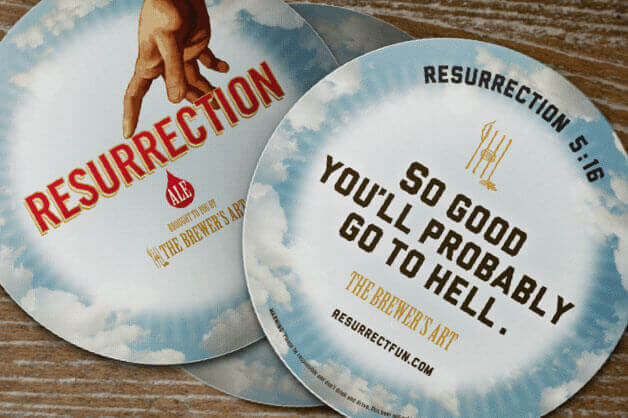

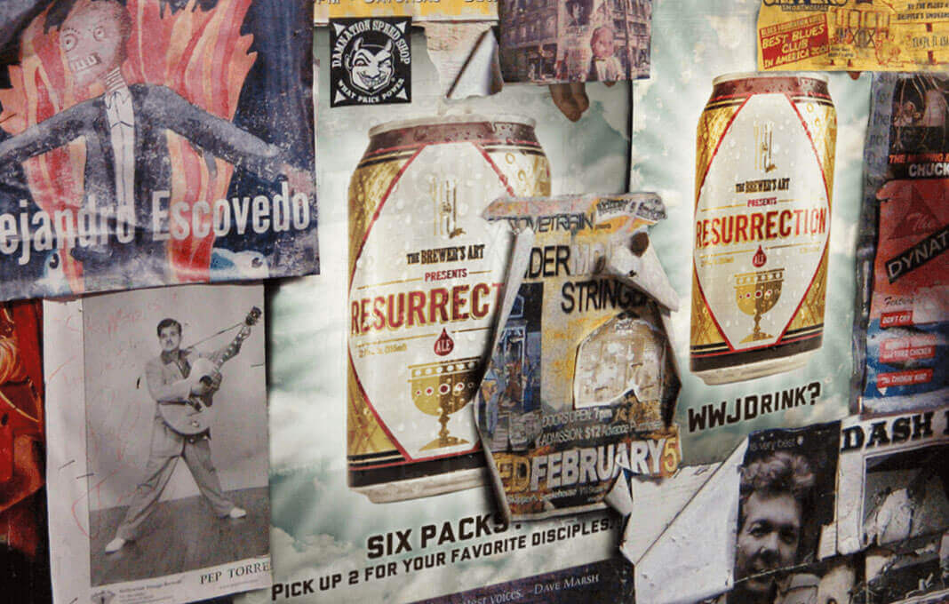
A date with the devil is a small price to pay.
Shockingly profane, yet artfully and prudently blended irreverent, with sophistication and charm. A mix of the obvious and not so obvious allowed us to tread into dangerous territory. Fortunately, the owners at Brewer’s live lives of zero regrets.
Oh so close to being allowed to drink their own product.
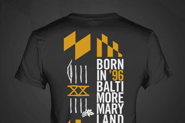
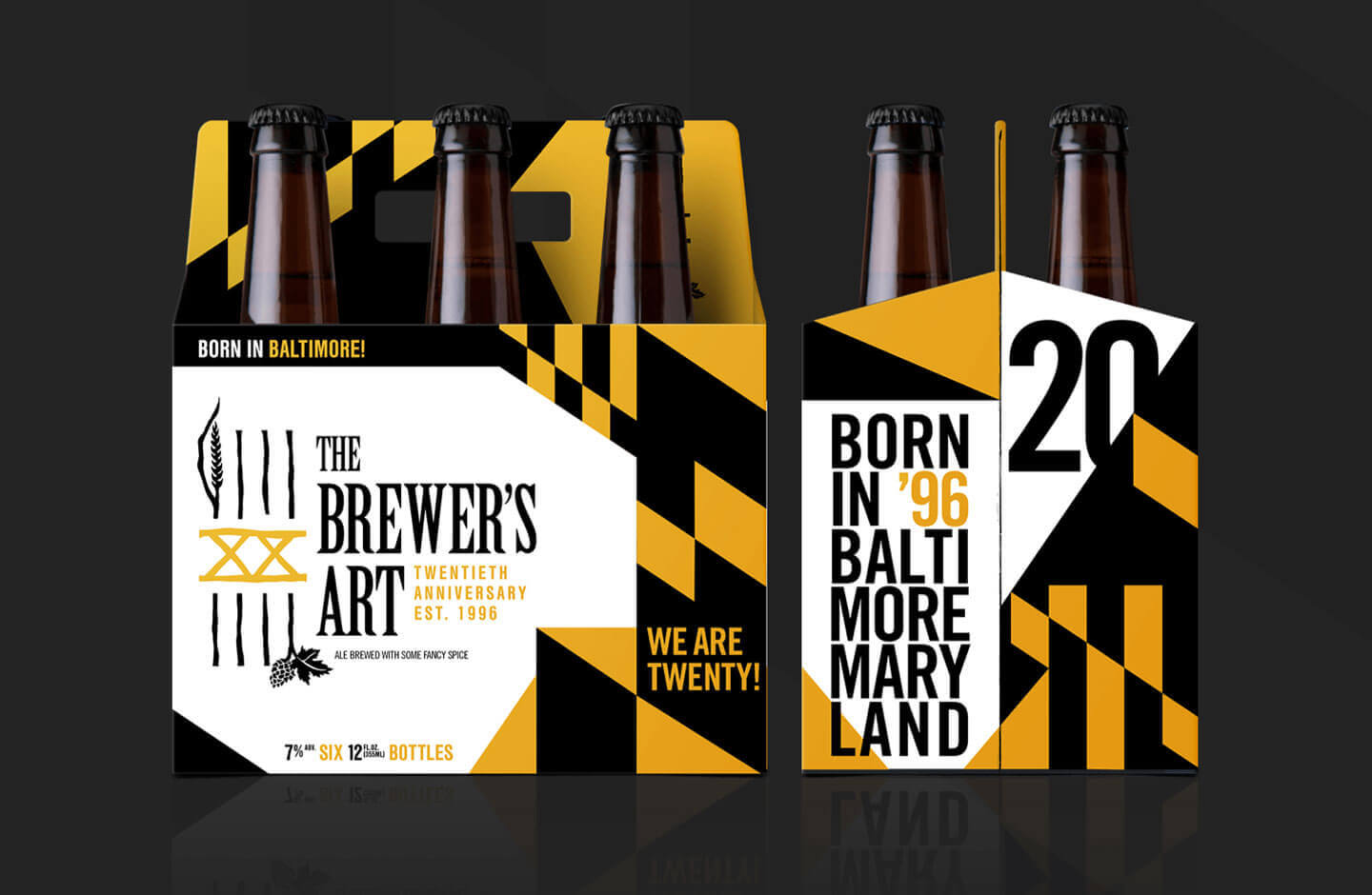
The 20th Anniversary creation was a celebration of Brewer’s accomplishment, of the state they call home and the momentum for the future.
Our desire has always been to look contemporary, but also like something you may find in your grandfather’s garage. Classic, old-school feel with a modern twist.
Father Thomas Creegan, Partner, The Brewer’s Art