F&D Packaging
Packaging Redesign Honors Fordham & Dominion's Roots
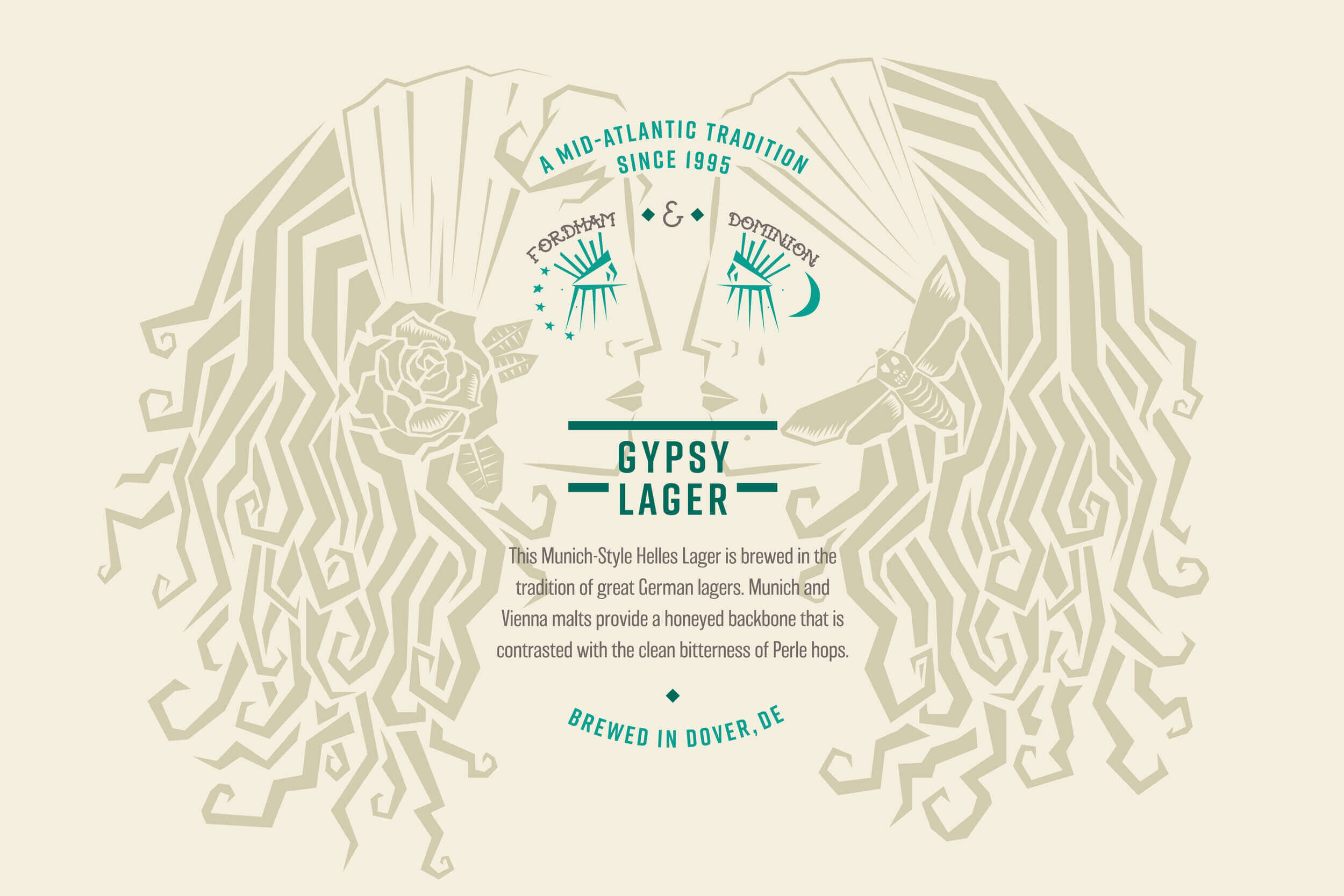
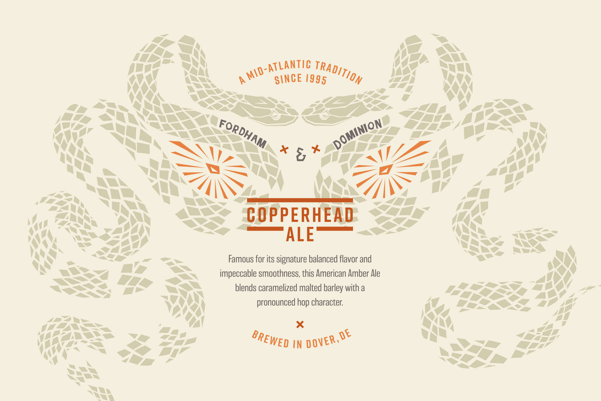
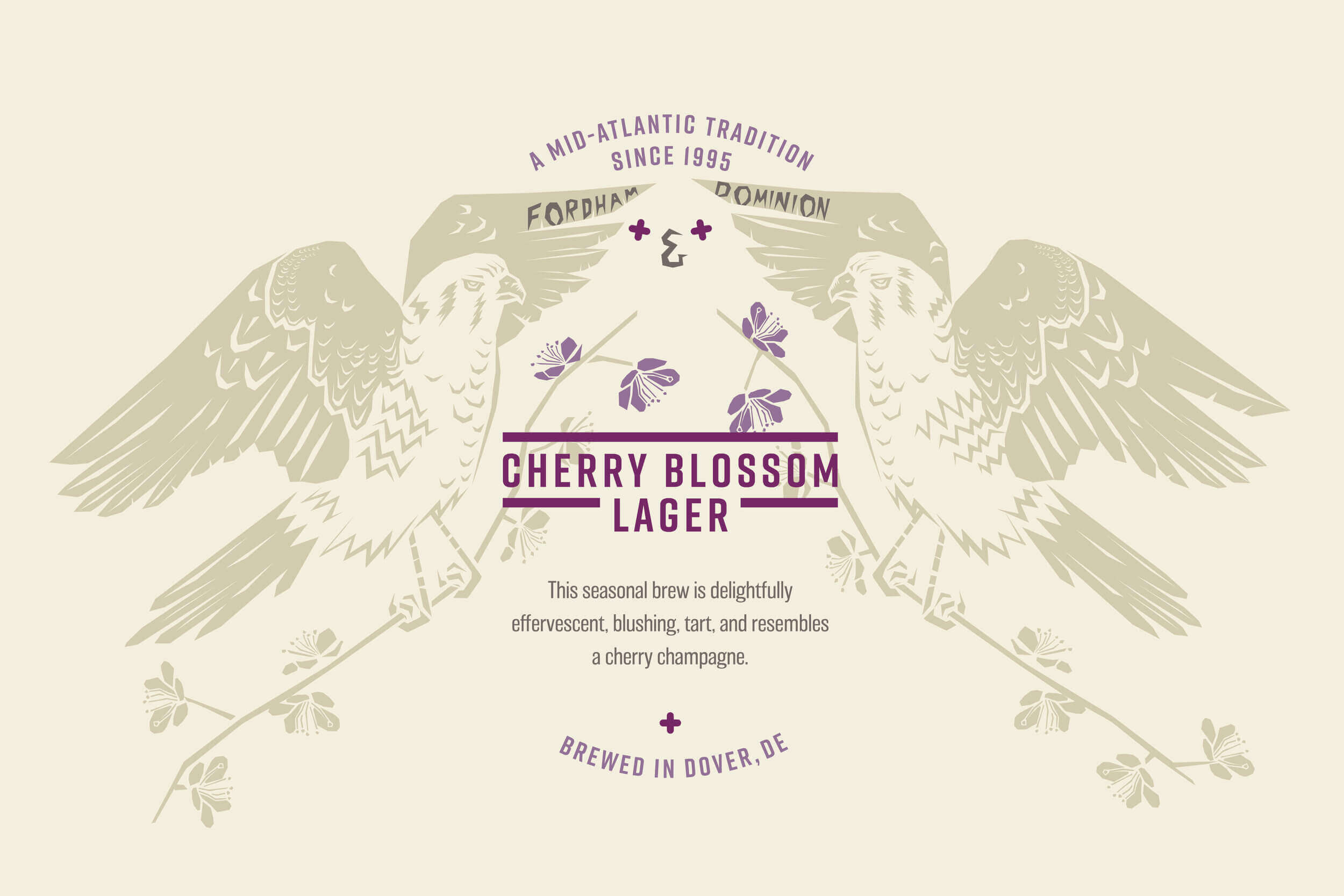
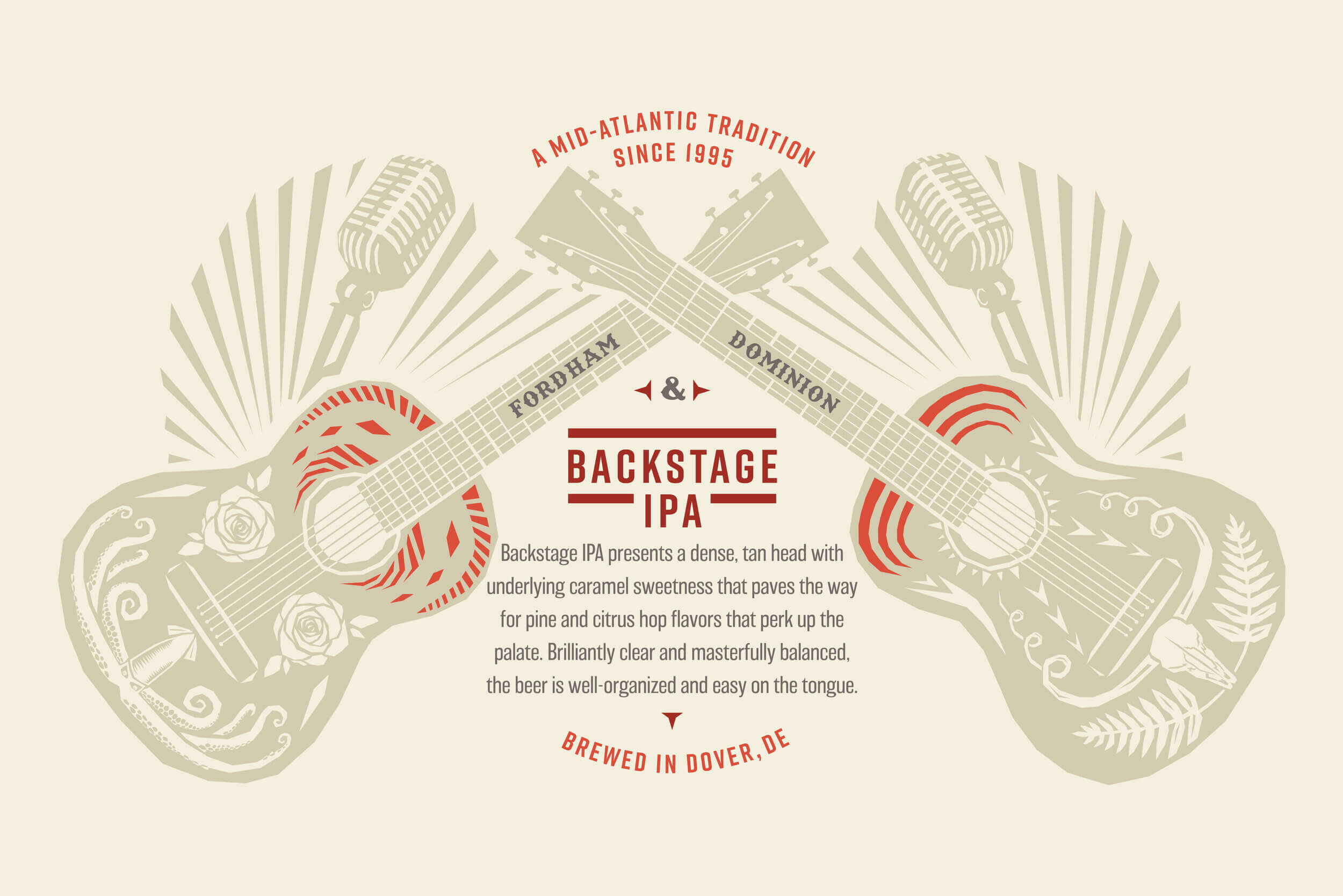
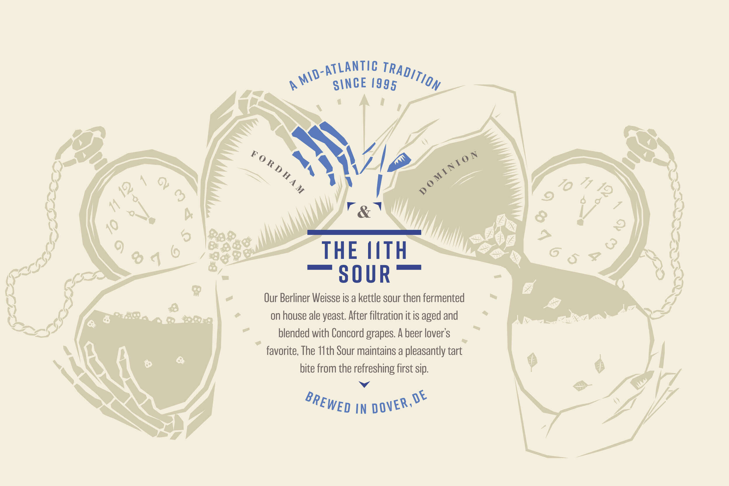
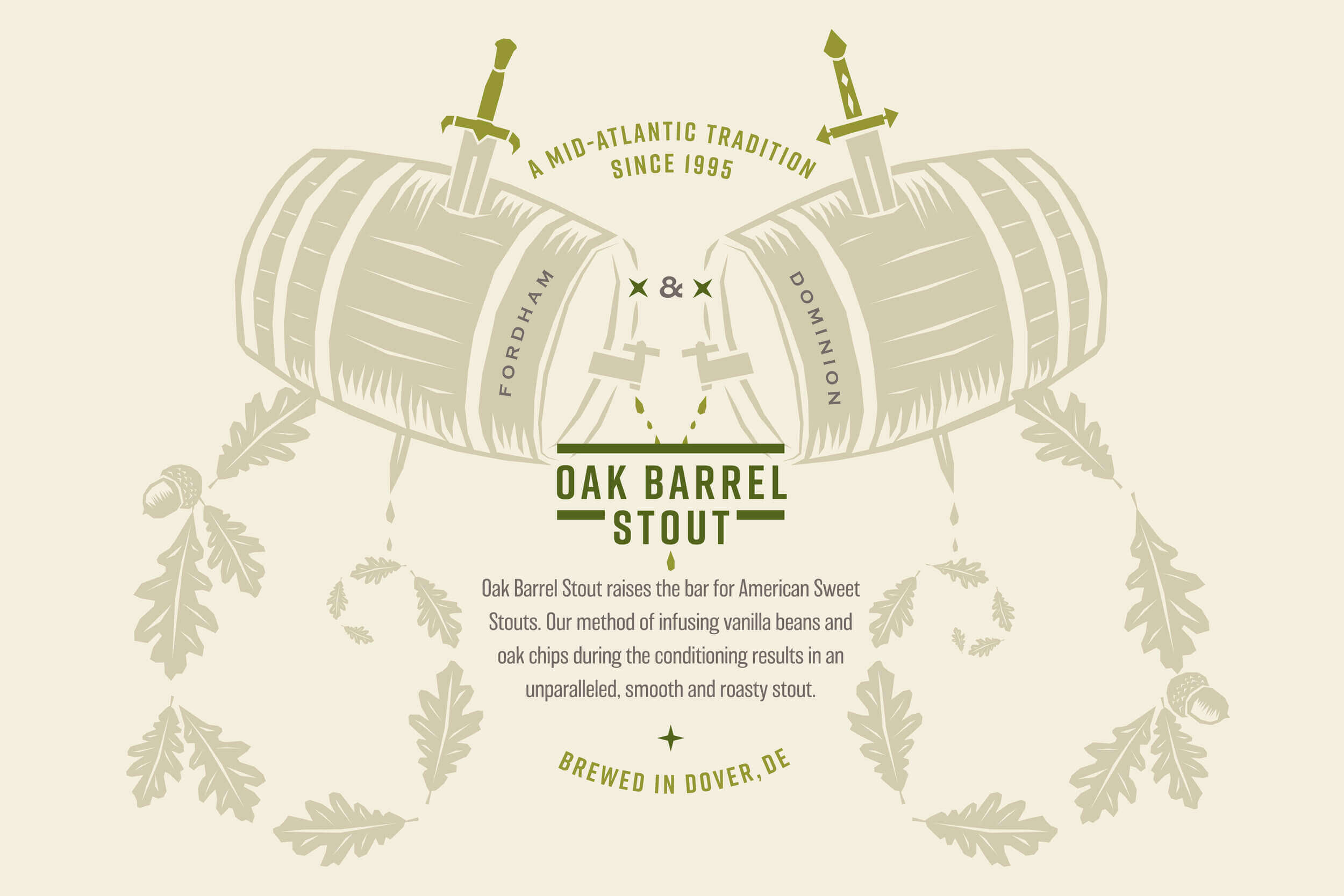
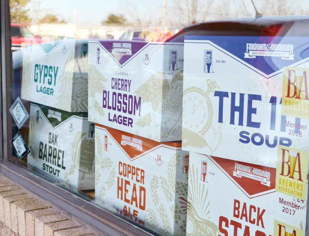
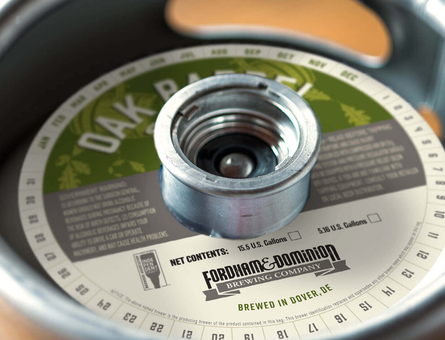
Fordham & Dominion Brewing Company has a rich history and a reputation for crafting beers as distinctive as the stories behind them. When they approached us to redesign their can and bottle labels, secondary packaging, and point-of-sale materials, we set out to create something that would honor their loyal fan base while appealing to a new generation of drinkers. What we built was a cohesive visual identity that unites the products while preserving their unique geographical roots and personalities.
Client
Industry
Capabilities
Brewing a New Identity
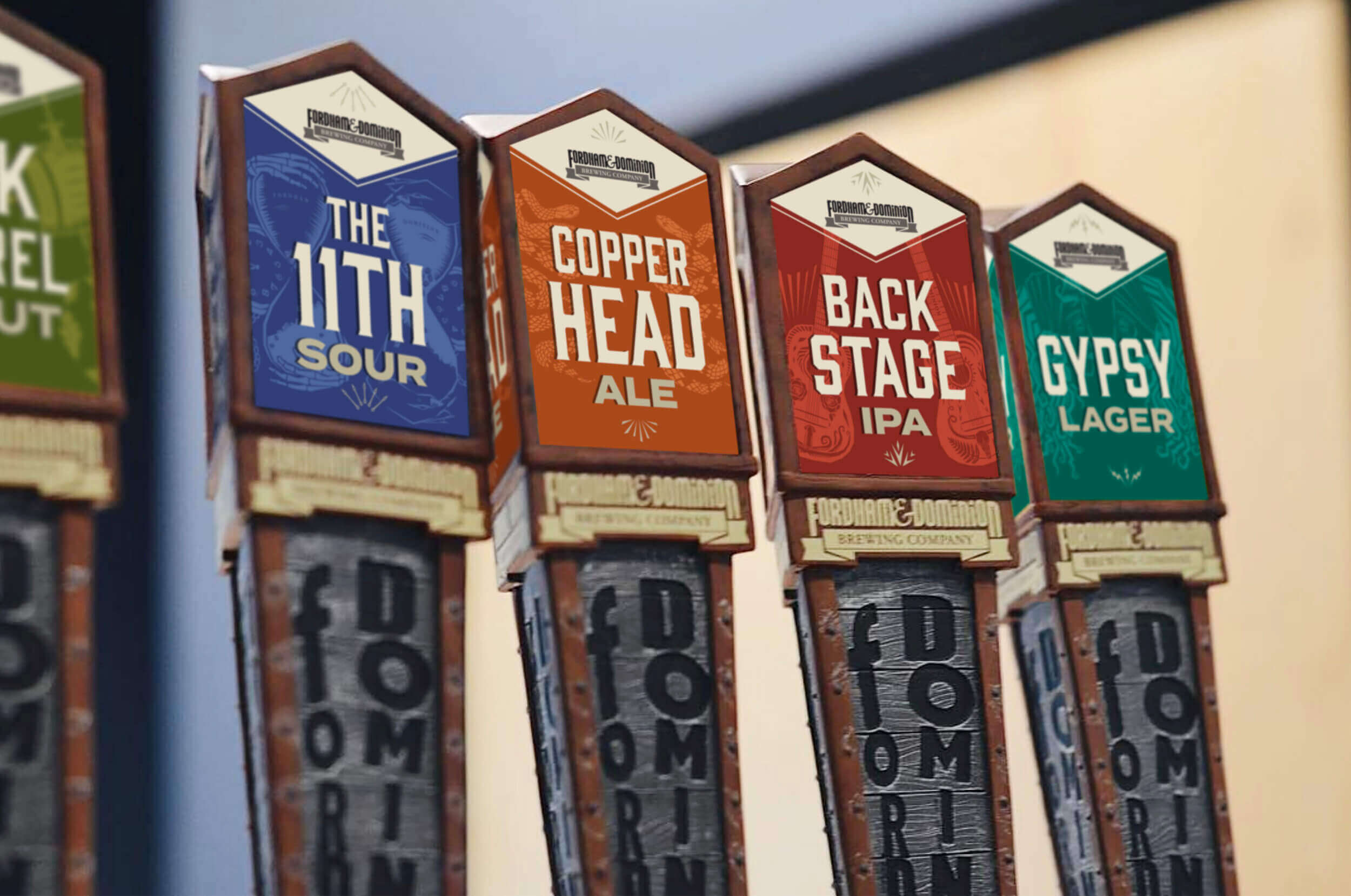
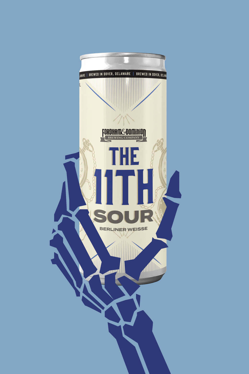
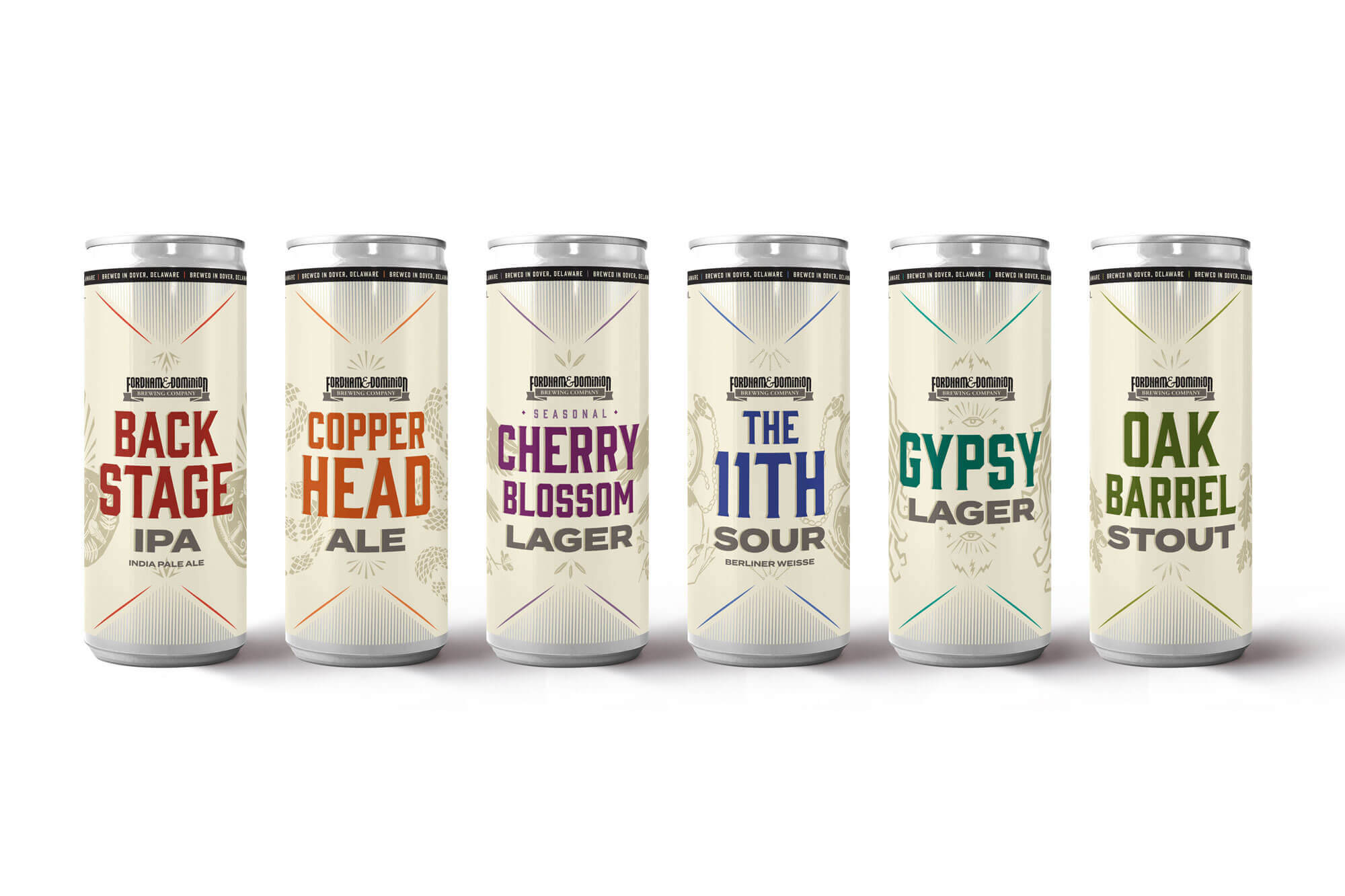
To help Fordham & Dominion stand out in a crowded craft beer market, we leaned into what makes them special: their storytelling. Each label features custom illustrations that capture the spirit of the beer, paired with a unified design framework that ties the family together. We infused the designs with clean, approachable elements that feel fresh and modern while remaining true to the brands’ heritage. From bold can and bottle labels to secondary packaging and POS materials, every piece was crafted to grab attention on shelves and spark curiosity among consumers.