Brand Identity & Campaign
Running with the Greyhounds
Loyola University Maryland came to us at an inflection point. The 200-year-old Jesuit institution had it all—a loyal community, a beautiful campus, a transformative student experience, and respected academics—but its brand wasn’t telling the full story. Our challenge wasn’t to build something from scratch. It was to isolate what Loyola really is, and then amplify it for the world to hear.
Client
Industry
WHAT WE DID
“Through the viewbook, immersive digital experience, and campus environment, the campaign transforms a brand promise into an experience—and gives prospective students a new question to consider: What could I become here?”
Kristen McGuire, Chief Marketing Officer @ Loyola University Maryland
We began by getting to know everything about the school. In partnership with Edge Research, we conducted focus groups with prospective students and alumni, coordinated listening sessions with current students, and sat in on countless group discussions with faculty and staff from across the university. All of that research, supplemented by additional surveys, culminated in a 62-page document of strategic takeaways that shaped every decision that followed. What we heard was nearly universal: Loyola’s values, traditions, and sense of place were deeply felt by everyone who’d experienced them, but the brand wasn’t telling the full story. So we got to work with the goal of honoring the prestige and equity the university already had, while dialing up how it showed up in the world.
A Brand Built to Connect
- 175 Years Of Loyola history honored through a modernized brand identity
- 3 Experiences Print, digital, and campus environments brought together through one campaign
- 1,394 Likes On the brand film’s Instagram launch post in just three days
“Working on Loyola’s brand campaign was especially meaningful because I wasn’t just approaching the work as a strategist, but as someone who had experienced the university firsthand. I knew what Loyola had meant to me as a student, and that gave me instincts and insights I could bring to the process. At the same time, it was important to step beyond my own experience and make sure we were building a brand that reflected what Loyola means to its community today and where it’s headed next.”
Ashleigh Long, Director of Accounts & Strategy
Putting Loyola to Words
We developed a brand platform rooted in Loyola’s Jesuit heritage and the lived experience of its students. High-level positioning aligned stakeholders around a single, shared direction, while three brand pillars mapping to mind, body, and spirit, a distinct brand voice, and a unique value proposition moved everything, and everyone, forward.
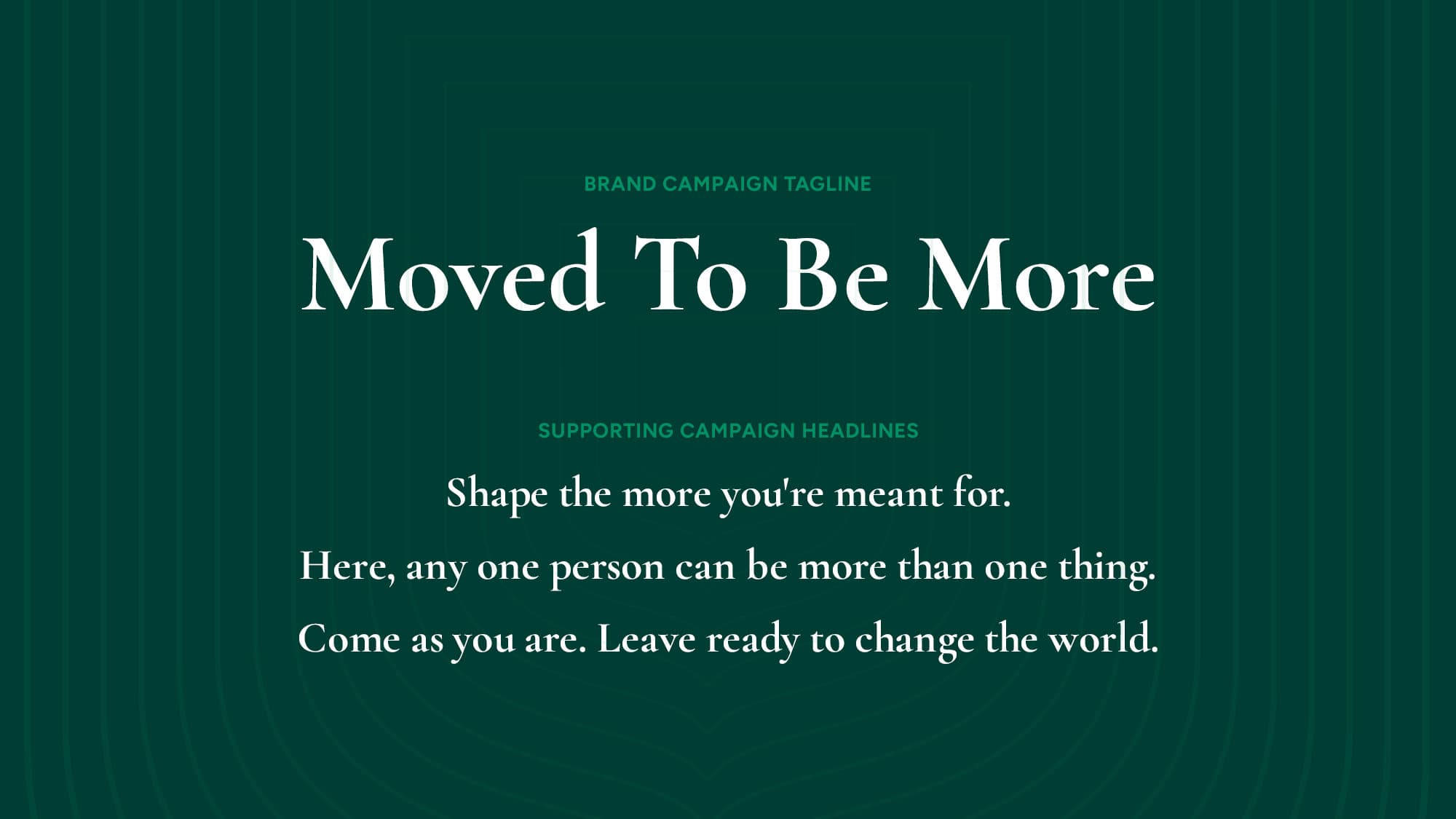
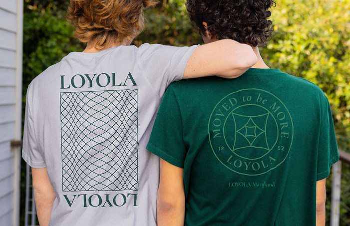
From that foundation, the campaign became undeniable. Moved To Be More almost self-selected through our research and ideation. The line surfaced early in the brand platform development process and we held onto it because nothing felt more true. In four words, it communicates Loyola’s transformative promise and each student’s journey toward becoming more. Whatever that “more” might be to them. Loyola doesn’t shape or mold students. They support students by creating the conditions for them to figure it all out themselves. Equally inspiring was the magis—a core principle of Ignatian spirituality. It’s a Latin word meaning “more” or “the greater,” and represents a call to choose the better way through service of God and others. “Be More” doubling as a nod to Loyola’s hometown of Baltimore was a happy accident. Seriously.
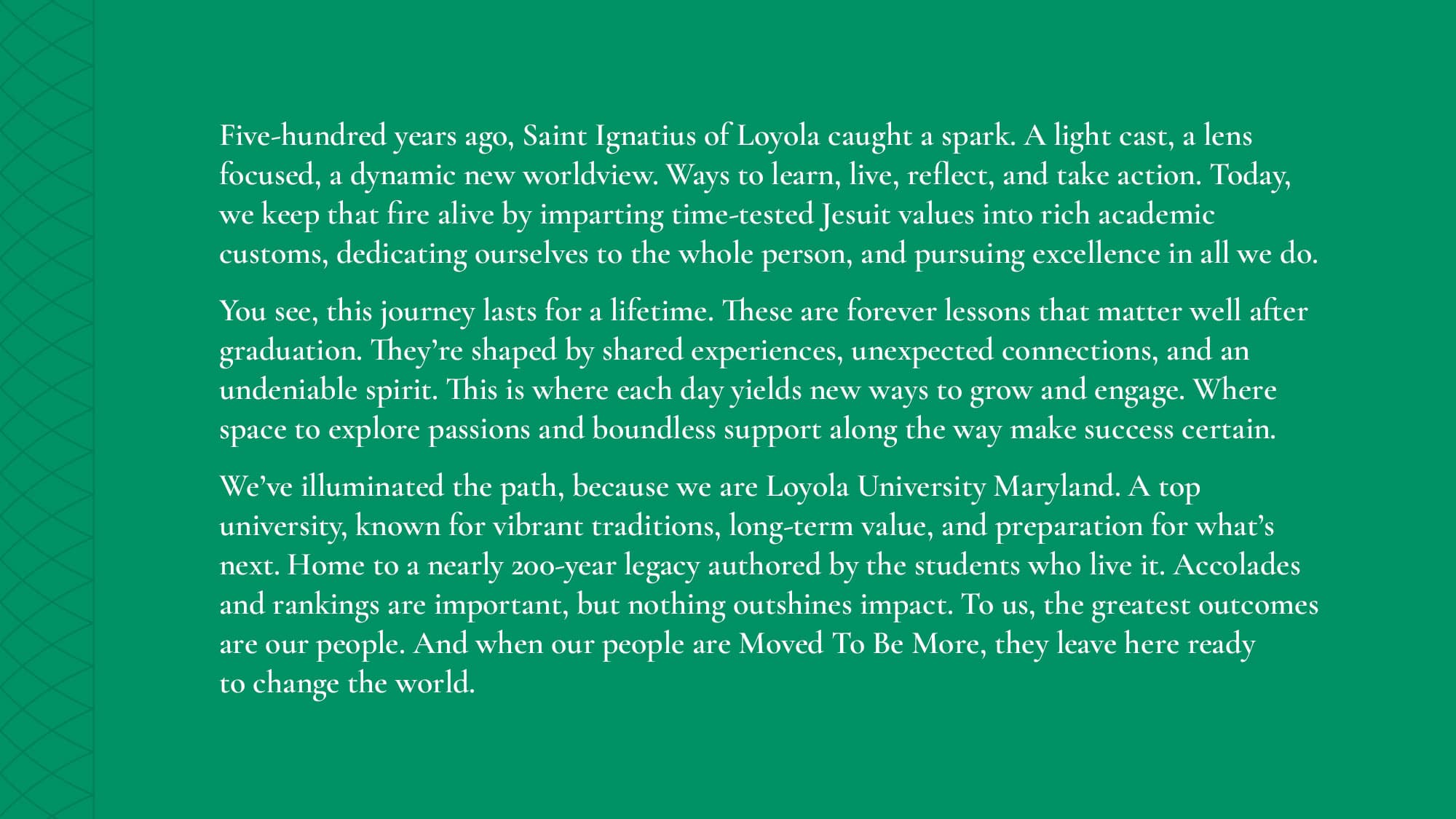
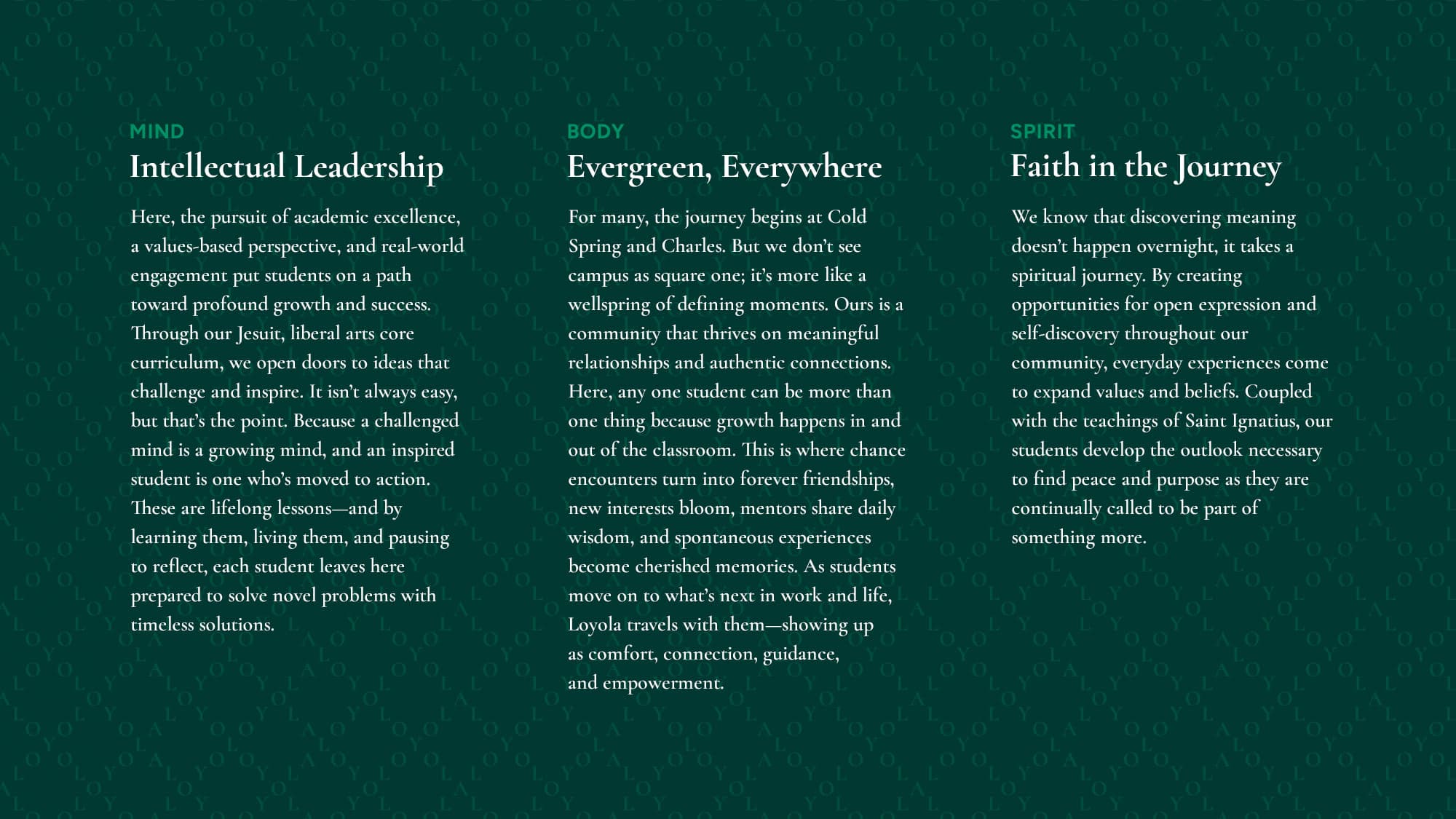
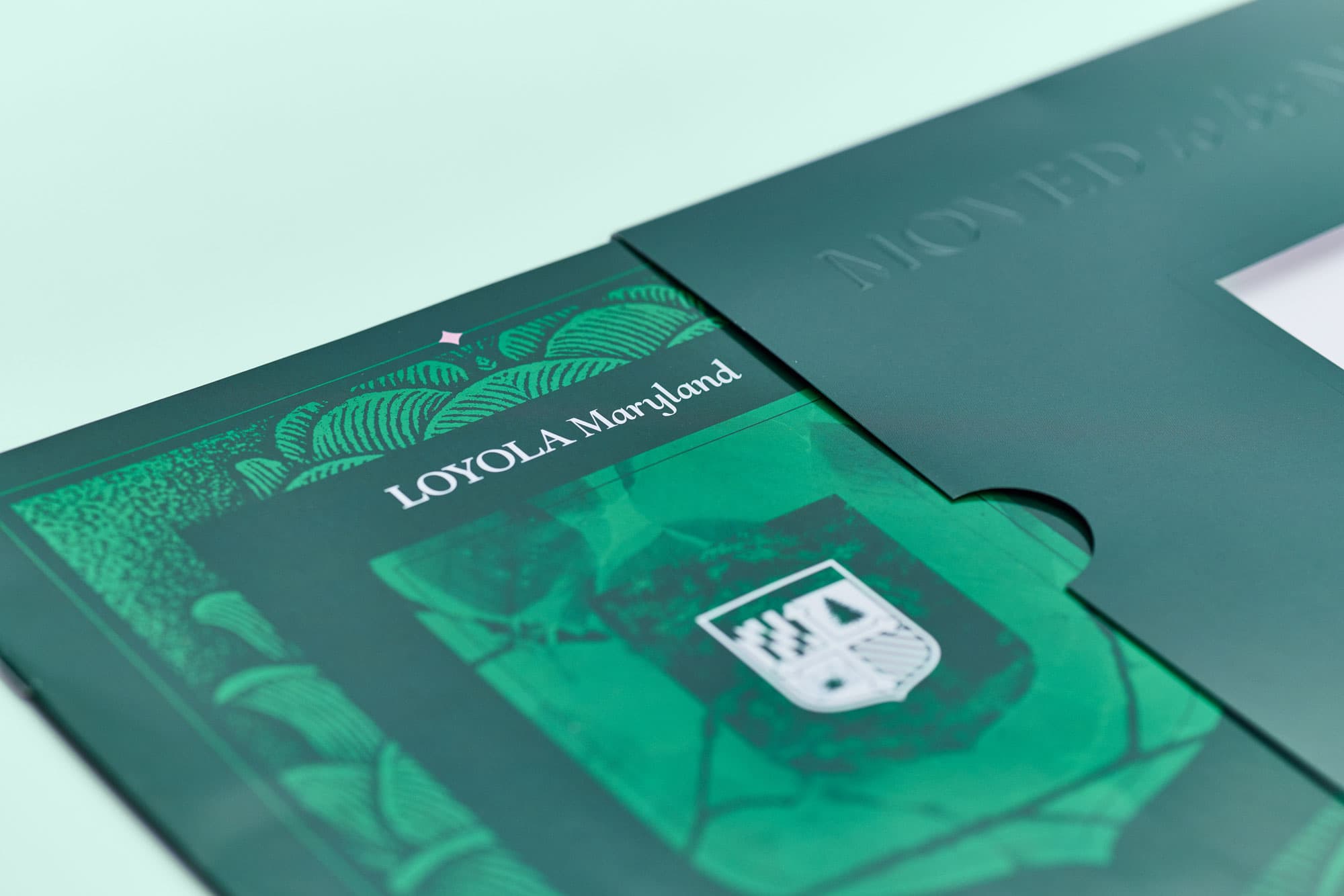
The prospective student viewbook was the first major expression of the new brand—an annual print piece reimagined to feel less like a brochure and more like an opening conversation. Flip through the viewbook.
Going Beyond Green & Grey
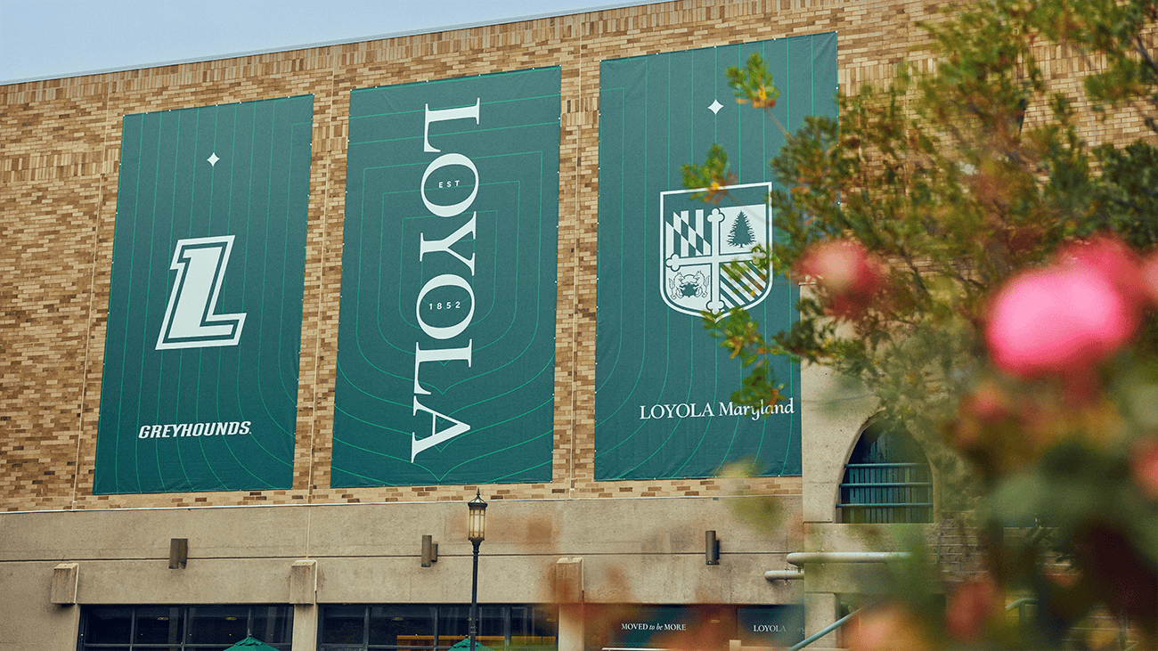
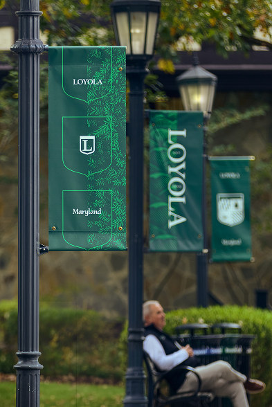
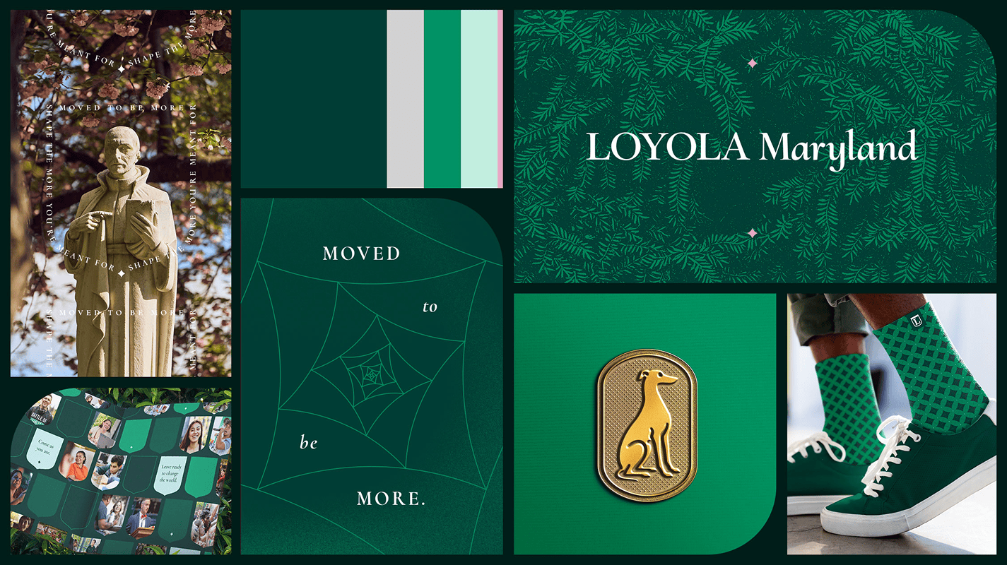
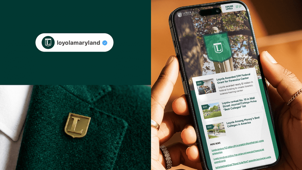
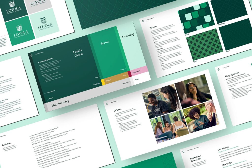
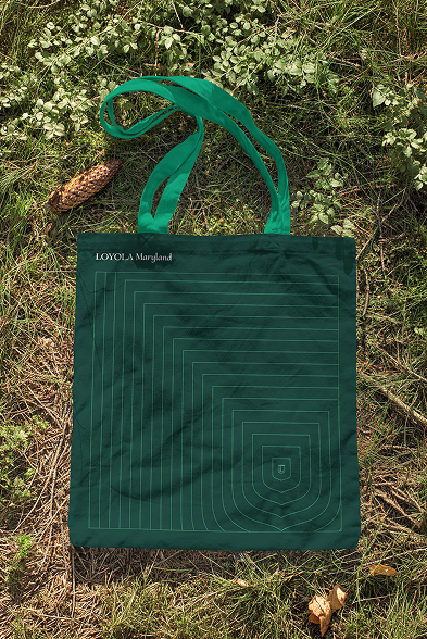
Updating the visual identity of an institution as storied as Loyola Maryland requires a careful touch. Our research revealed a deep affinity for existing imagery, so the core visual identity remains anchored in what Loyola already owned—deep greens and the iconic shield. But the system built around them was new. The shield was reimagined as an active graphic device: a container, framing tool, or pattern capable of showing up across formats without losing its weight. A spark, derived from the shield’s form, introduced energy and motion, nodding to the Ignatian idea that transformation begins with a single moment of ignition. Patterns, campus-rooted textures, and a suite of badges (the Evergreen, the Stained Glass, the Greyhound) gave the system depth. Typography does the rest: Cormorant houses heritage, Figtree keeps it modern. The visual identity is grounded in legacy and racing toward a bright future for the institution and its students.
“We heard in the research that the shield and the deeper green very much connected with current and past students, so we didn’t want to make wholesale changes. The goal was subtle adjustments that made the identity more versatile across today’s shifting visual mediums—then expanding the visual language to really dial in on what makes Loyola unique. Always balancing an elevated approach with a sense of place and a welcoming spirit.”
Steve Semanchik, Senior Art Director
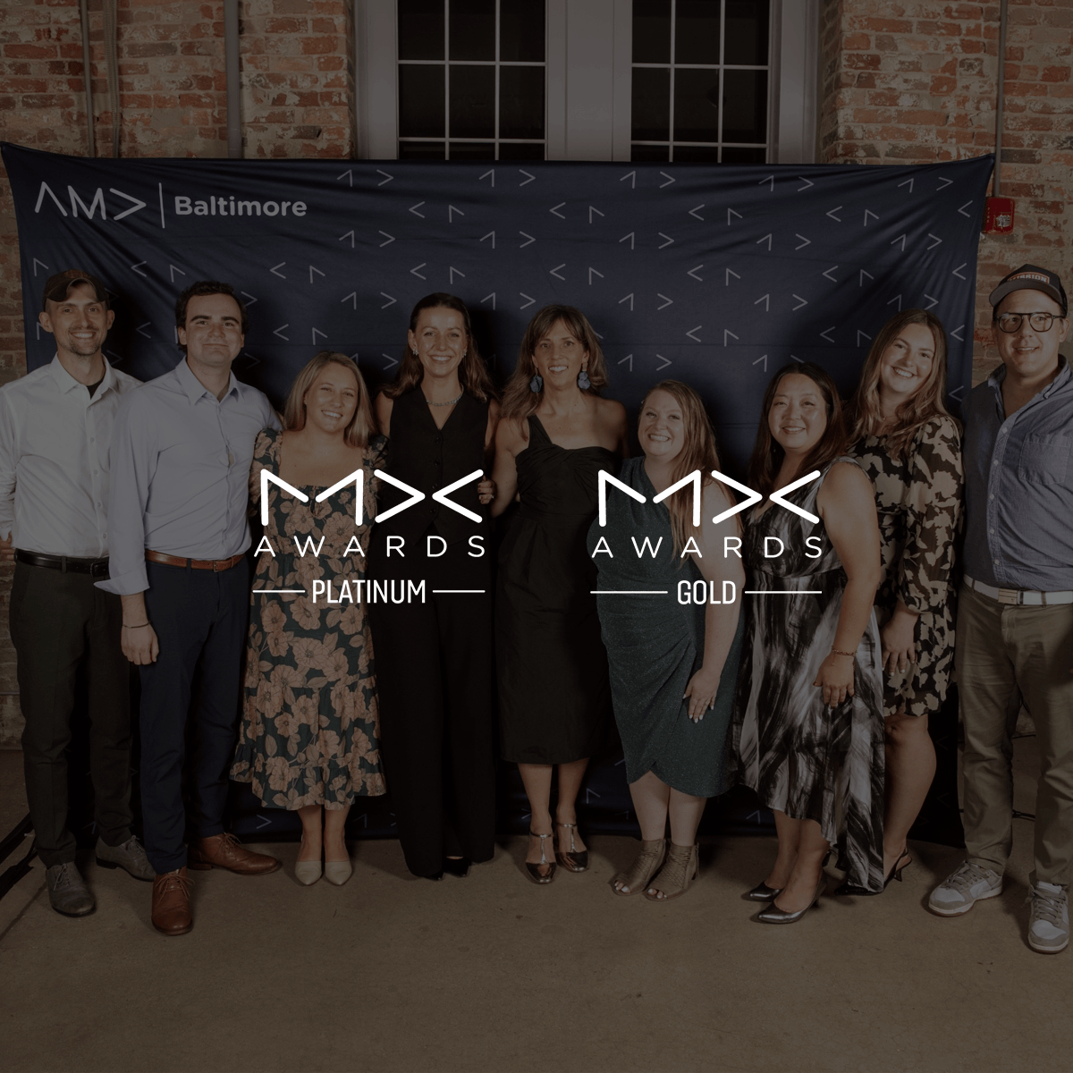
MX Awards 2026: Gold & Platinum
Mission’s work with Loyola University Maryland was recognized at the AMA MX Awards, taking home awards for both Brand Identity and Campaign. These wins celebrate a collaborative effort to bring Loyola’s distinctive story to life through a refreshed brand and creative campaign that captures the spirit of the university and the community that makes it special.