Maryland Science Center Branding
Let's Science (Again)!
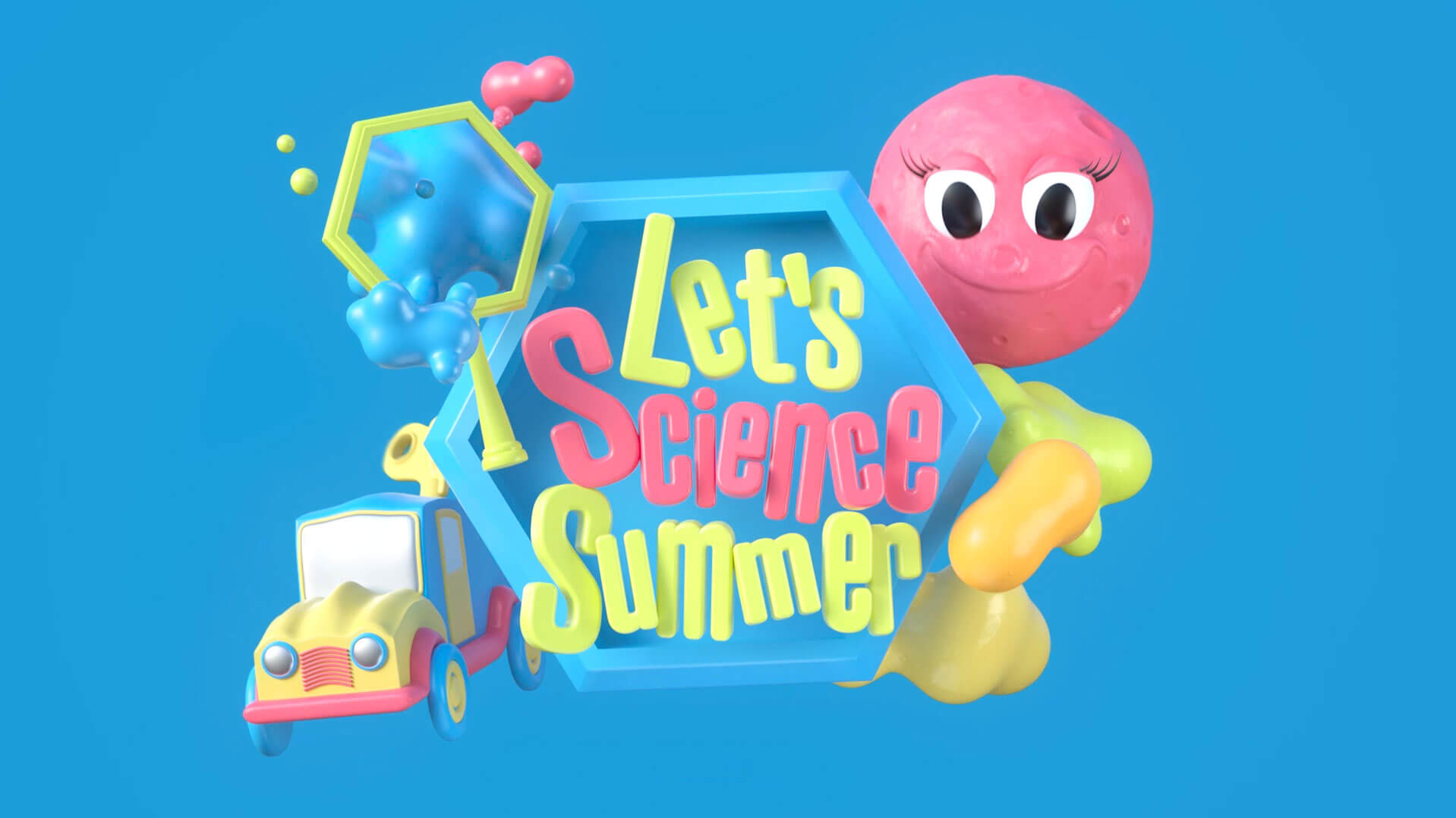
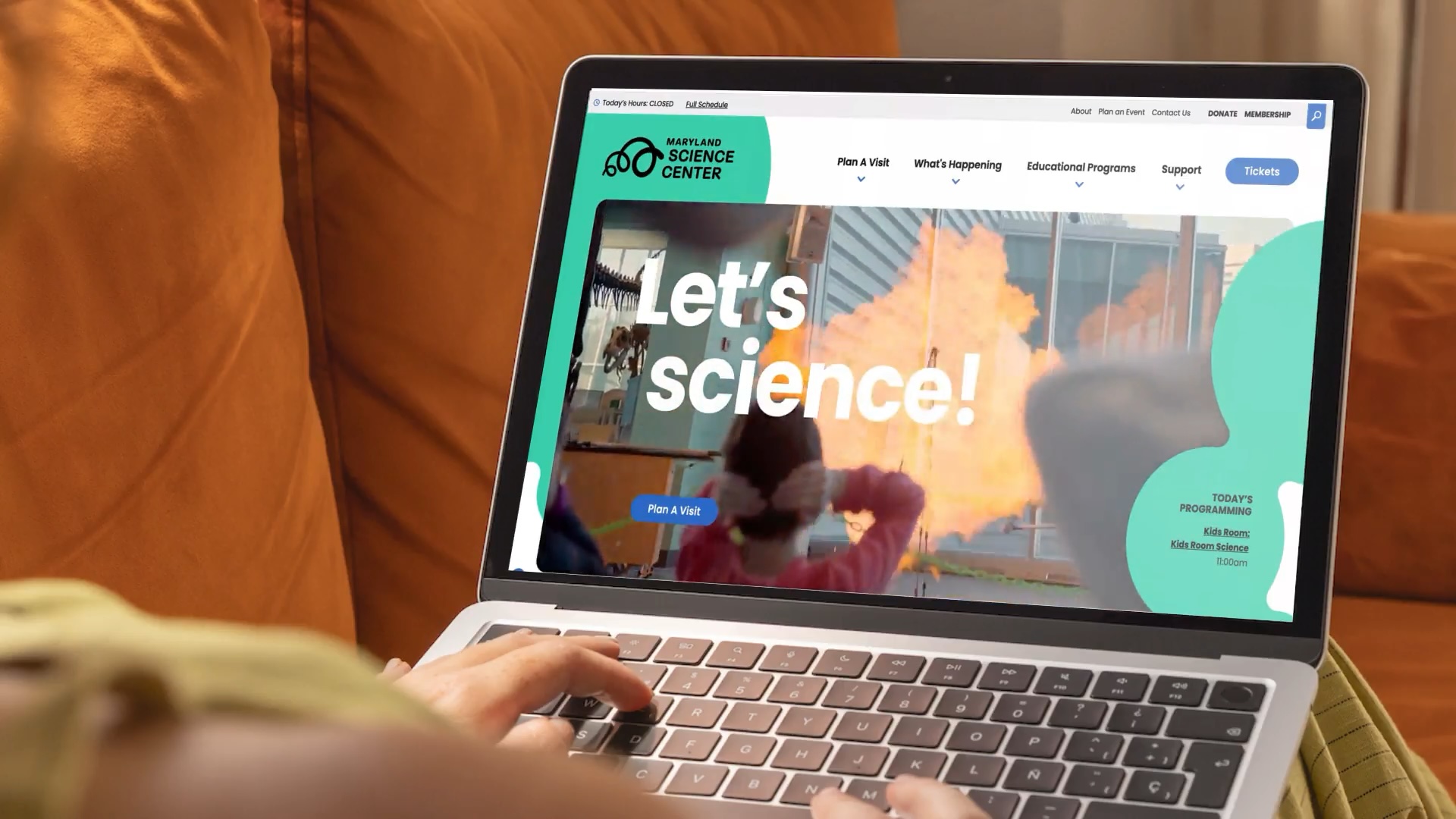
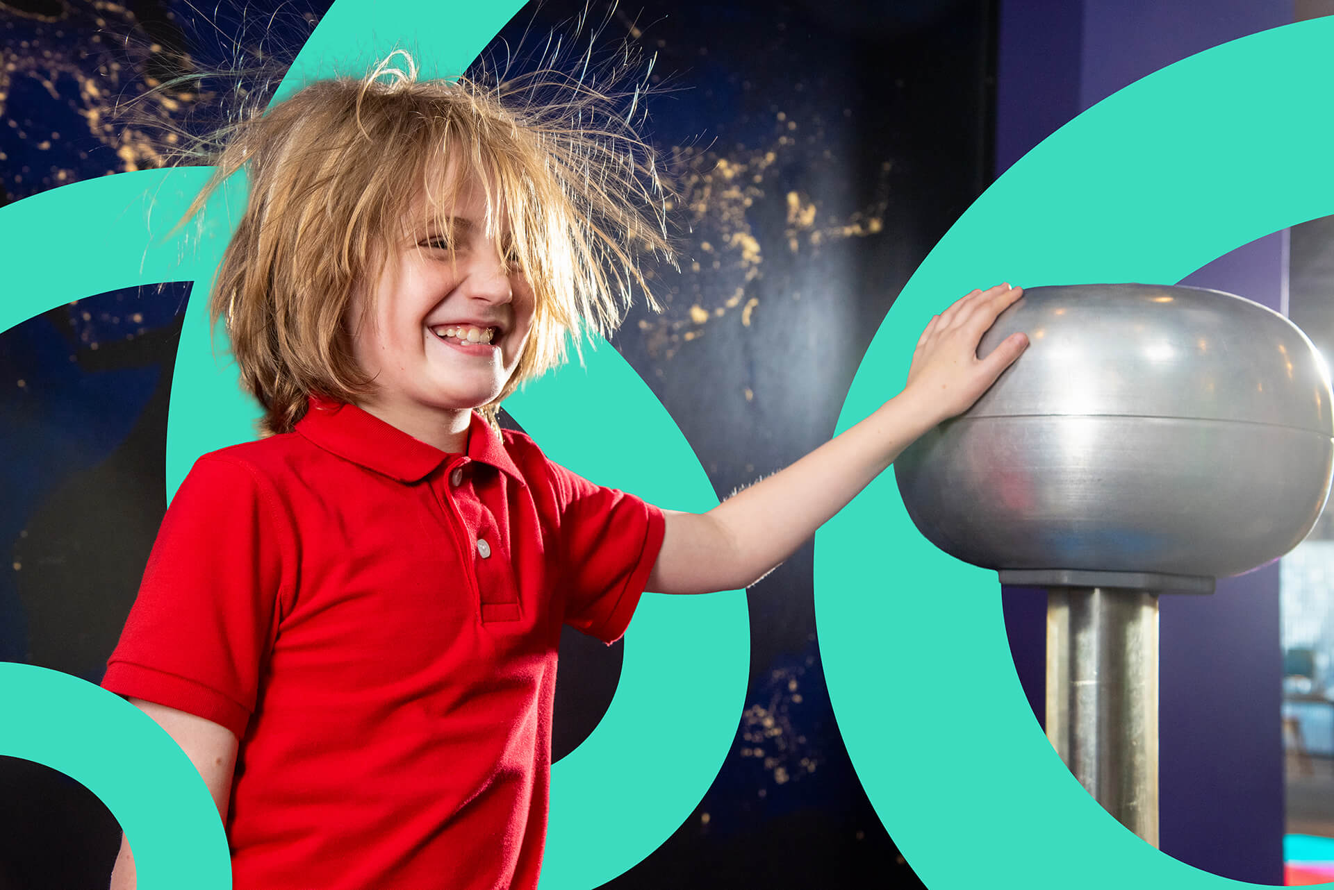
Nearly a decade ago, we collaborated with the Maryland Science Center on a brand identity and website that matched the energy of their exhibits. As the Science Center approached their 50th anniversary, it was time for another evolution. We reimagined the long-standing brand to capture the experience of being inside the building—energetic, tactile, full of curiosity—and translate it into a flexible system that feels just as at home with a curious five-year-old as it does with a seasoned scientist.
Client
Industry
WHAT WE DID
The Work Behind the Wonder
We believe that building great brands starts with listening. We brought together stakeholders from across the Maryland Science Center, each with a different perspective on how the brand shows up in their day-to-day work, and guided them through our process. A series of questionnaires, conversations, and brand workshops helped uncover what makes the Science Center unlike any other destination in Baltimore’s Inner Harbor.

The process surfaced some foundational decisions: leaning into the word “museum” (which, it turns out, is something to own, not shy away from), defining a tone that’s playful and accessible without talking down to anyone, and landing on a core differentiator that sets the Science Center apart from nearby attractions—here, visitors don’t just observe science. They’re the ones driving the discoveries.
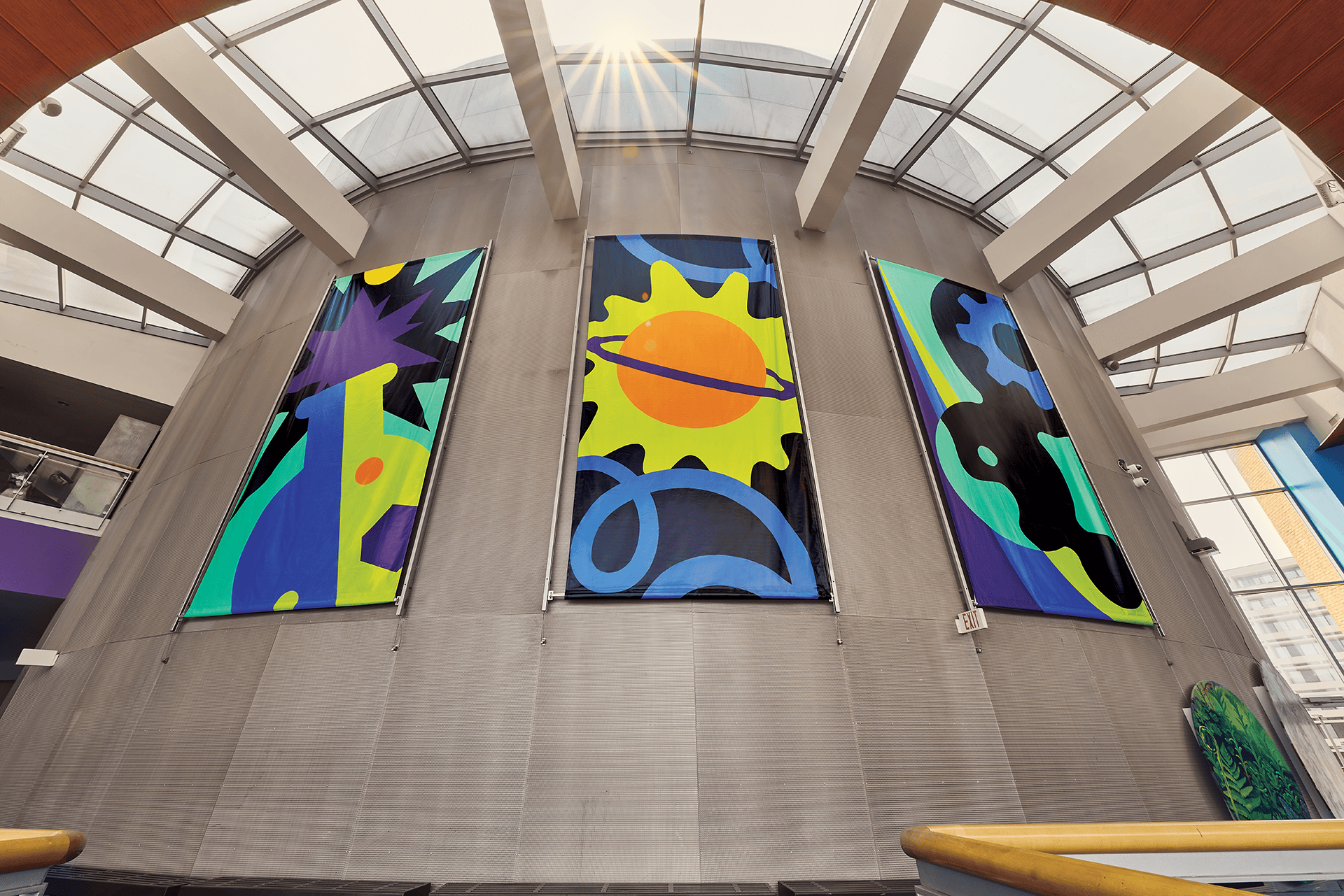
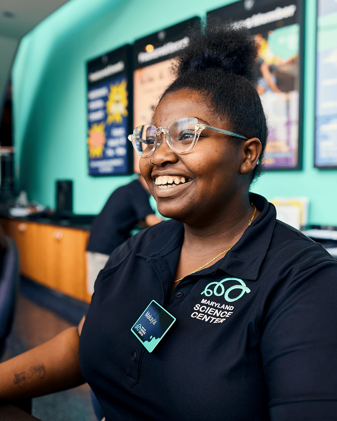
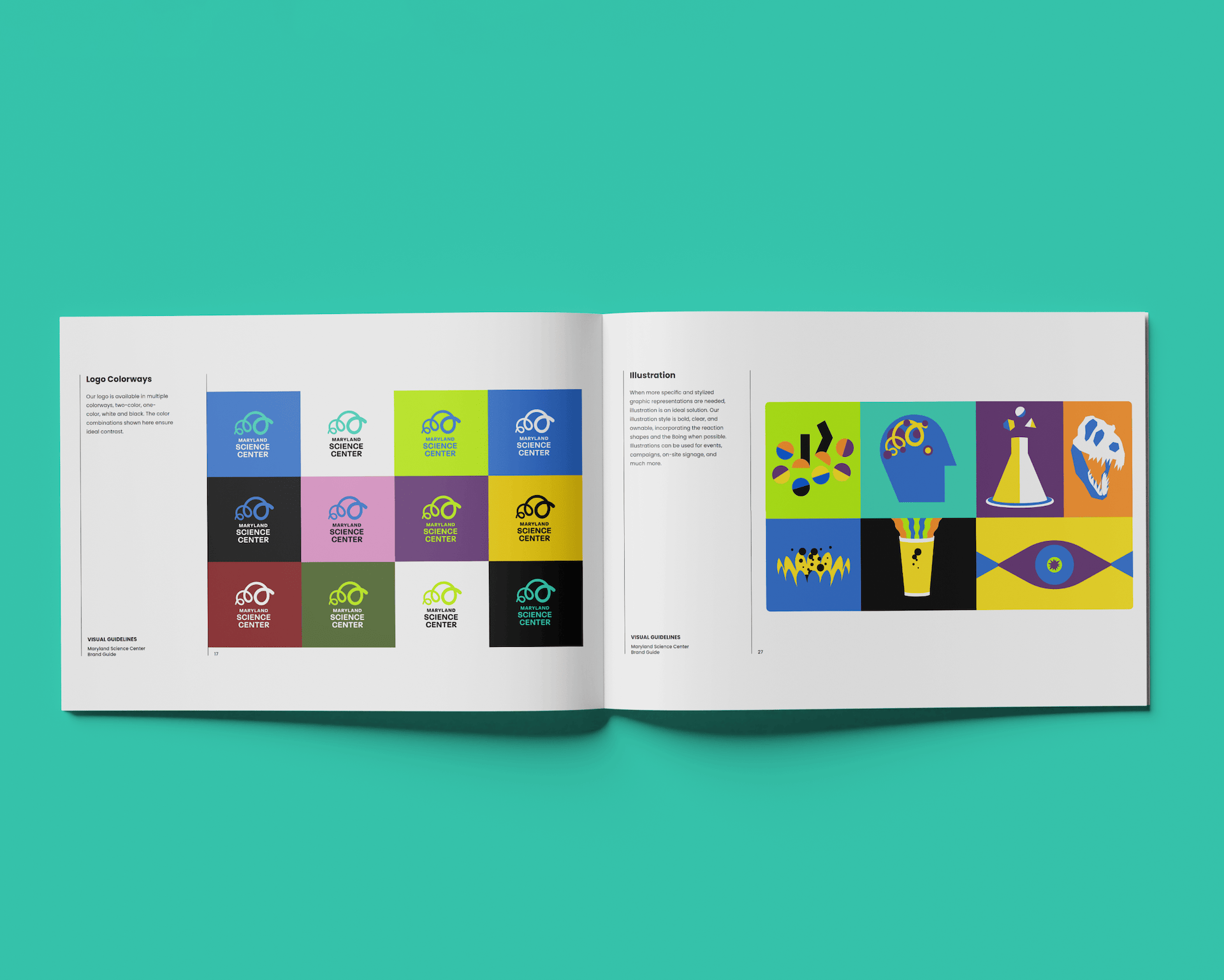
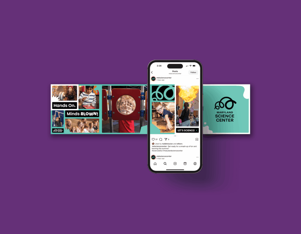
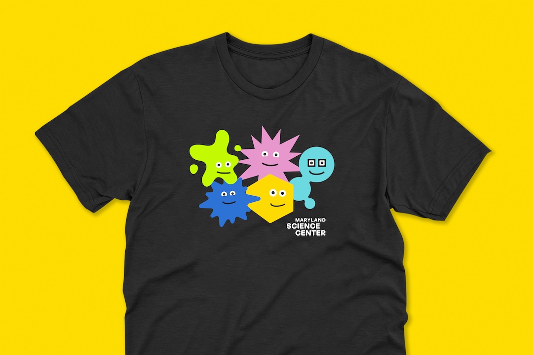
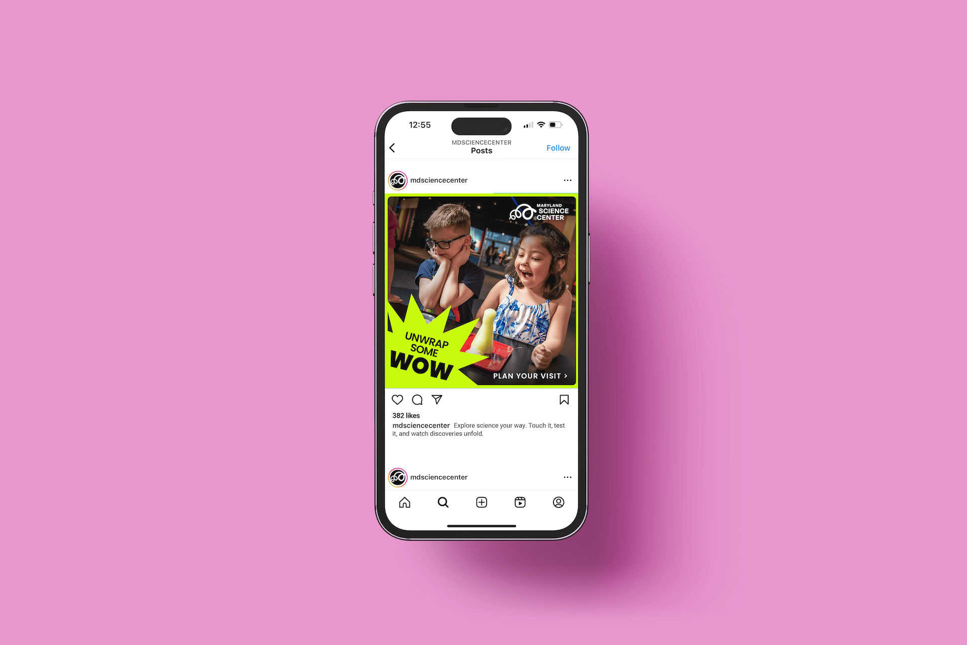
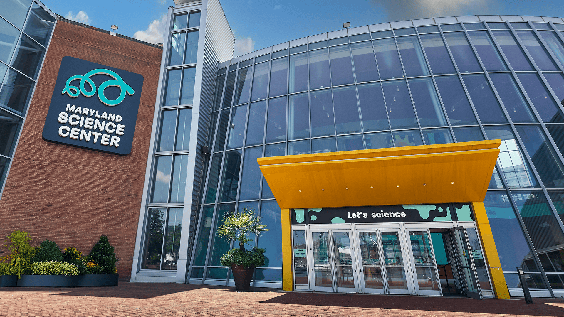
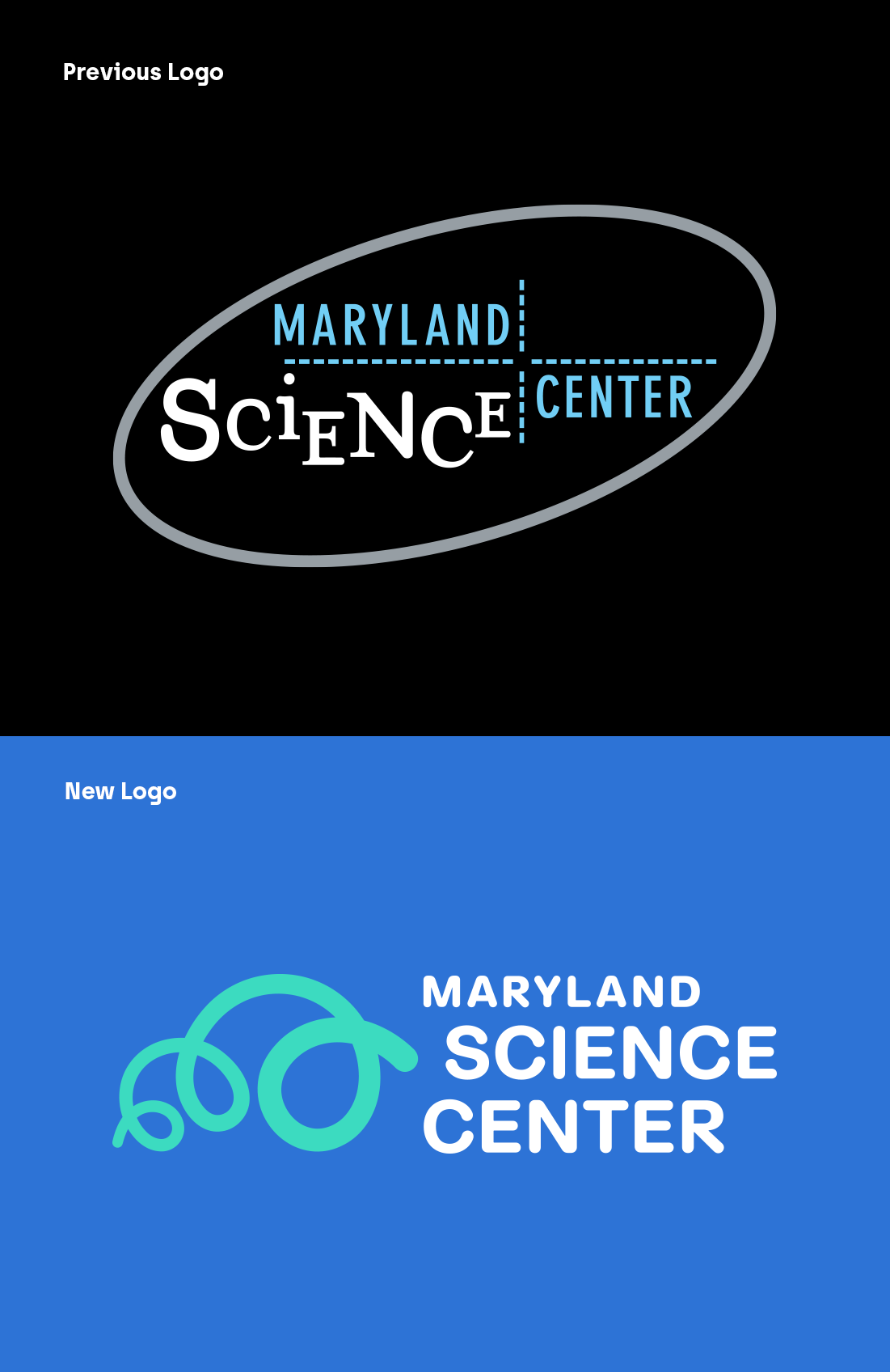
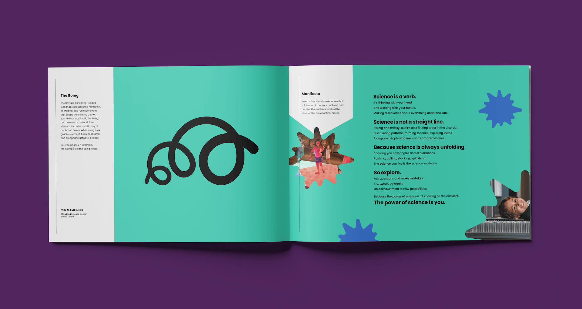
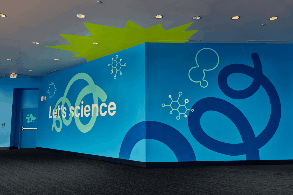
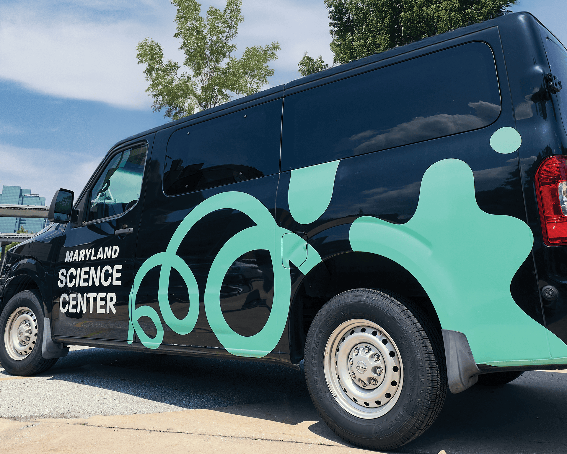
That insight shaped everything that followed. We developed a brand platform and identity that feel as active as the experience of going to the Science Center. A spring-loaded logo, energetic typography, vibrant colors, and a flexible system are built to live anywhere—from advertising and social media to exhibit graphics and environmental signage inside and outside the building. The brand moves with visitors, encouraging them to test, tinker, and discover for themselves.